PROJECTS / ADVSR
Brand Identity for Legal and Accounting Firm ADVSR
We evolved the way ADVSR presents its brand, retaining its established logo, colours and typography. The project brings core identity guidance together with application concepts spanning business documents, spaces, client communications and digital interactions.
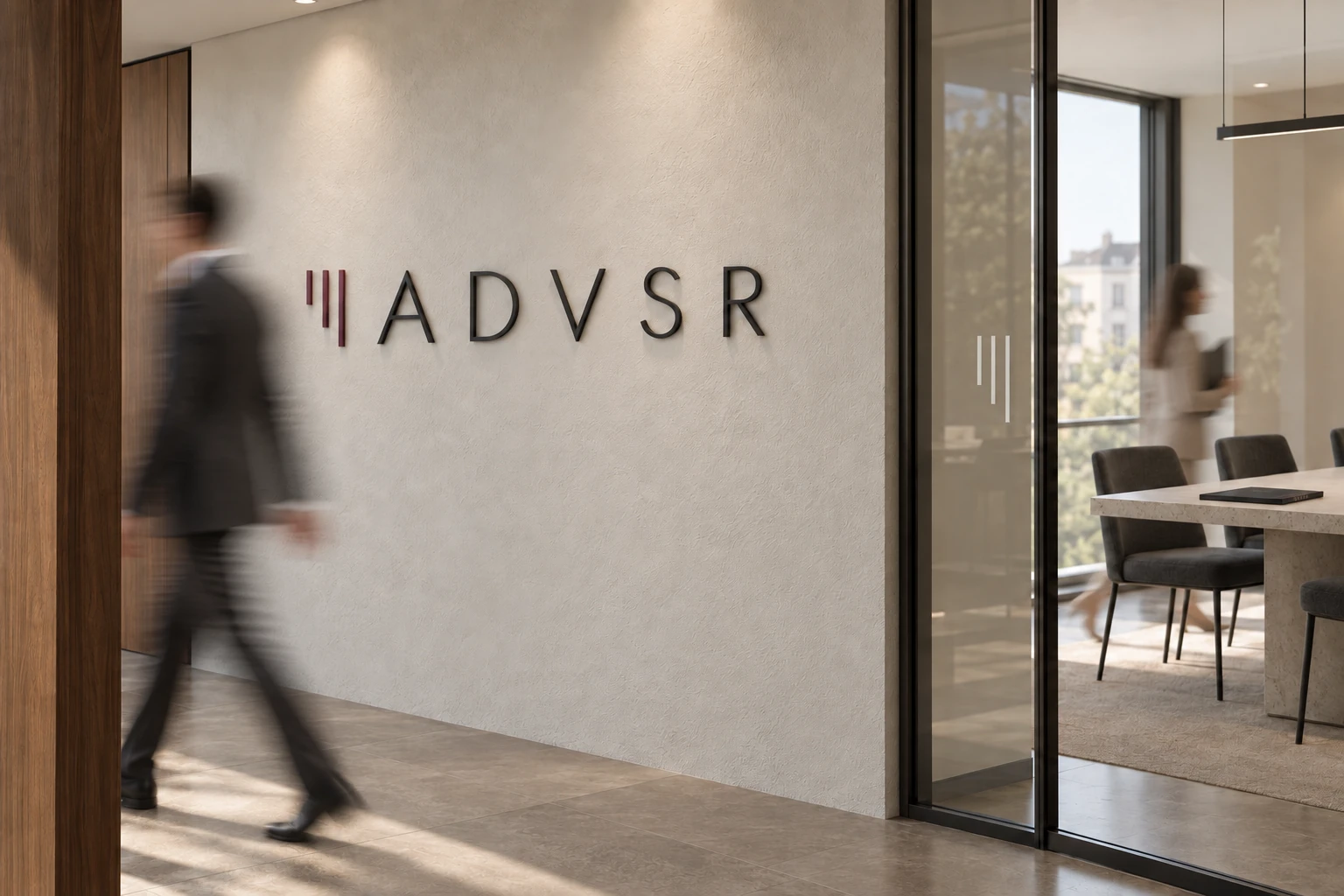
This case study presents visual guidelines and brand application concepts. Images of products, interiors and people are design visualisations. The client portal is an interface concept.
- Client
- ADVSR
- Sector
- Legal and accounting services
- Agency
- Juice Digital Agency
The existing logo, palette and typeface remain the foundation of the brand.
Logo application, colour and typography presented as one coherent system.
Documents, meetings, gifts and everyday objects give the identity a tangible context.
ABOUT THE CLIENT
A growing firm with an established identity
ADVSR provides legal and accounting services. In this sector, a company’s reputation is experienced through professional judgement, clear communication and attention to detail, from the first introduction to ongoing work with documents.
When our collaboration began, ADVSR had a team of five. Today, that team numbers around fifteen. As the firm grew, so did the expectations placed on its presentation. The core identity remained in place, giving us a familiar foundation for its next stage.
THE CHALLENGE
Give the identity room to develop
The task was to bring ADVSR’s brand presentation into line with the scale and maturity of the business. We focused on how the existing identity could be applied with greater consistency, presence and care.
That meant considering the full context in which people encounter the firm. A report on a client’s desk, a meeting room and a personal invitation each serve a different purpose. All should feel recognisably ADVSR.
OUR APPROACH
Professional precision, with a human presence
The creative direction pairs a disciplined graphic system with moments from working life. The logo’s geometry, a restrained palette and measured typography establish order. Light, material texture, gestures and movement give that structure warmth and scale.
Juice Digital Agency developed this direction through visual guidelines and application concepts. The objects are shown in use: an invitation being opened, a gift being unwrapped, notebooks set out before a meeting.
Retain the logo, three brand colours and Jost type family.
Set out recommendations for backgrounds, clear space, colour and type weights.
Develop concepts for business materials, gifts, spaces and everyday objects.
Bring the applications together in a consistent visual narrative.
LOGO APPLICATION
A precise mark, with space to breathe
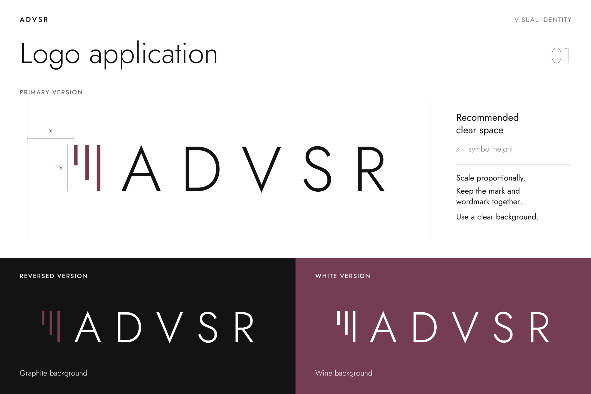
The fine ADVSR wordmark and its three vertical strokes establish the identity’s visual rhythm. The updated presentation sets out the principal applications on white, graphite and wine backgrounds.
A recommended clear space gives the mark room to stand on its own. Consistent proportions, an intact composition and an uncluttered background guide its use across different scales.
BRAND COLOURS
Wine, graphite and white
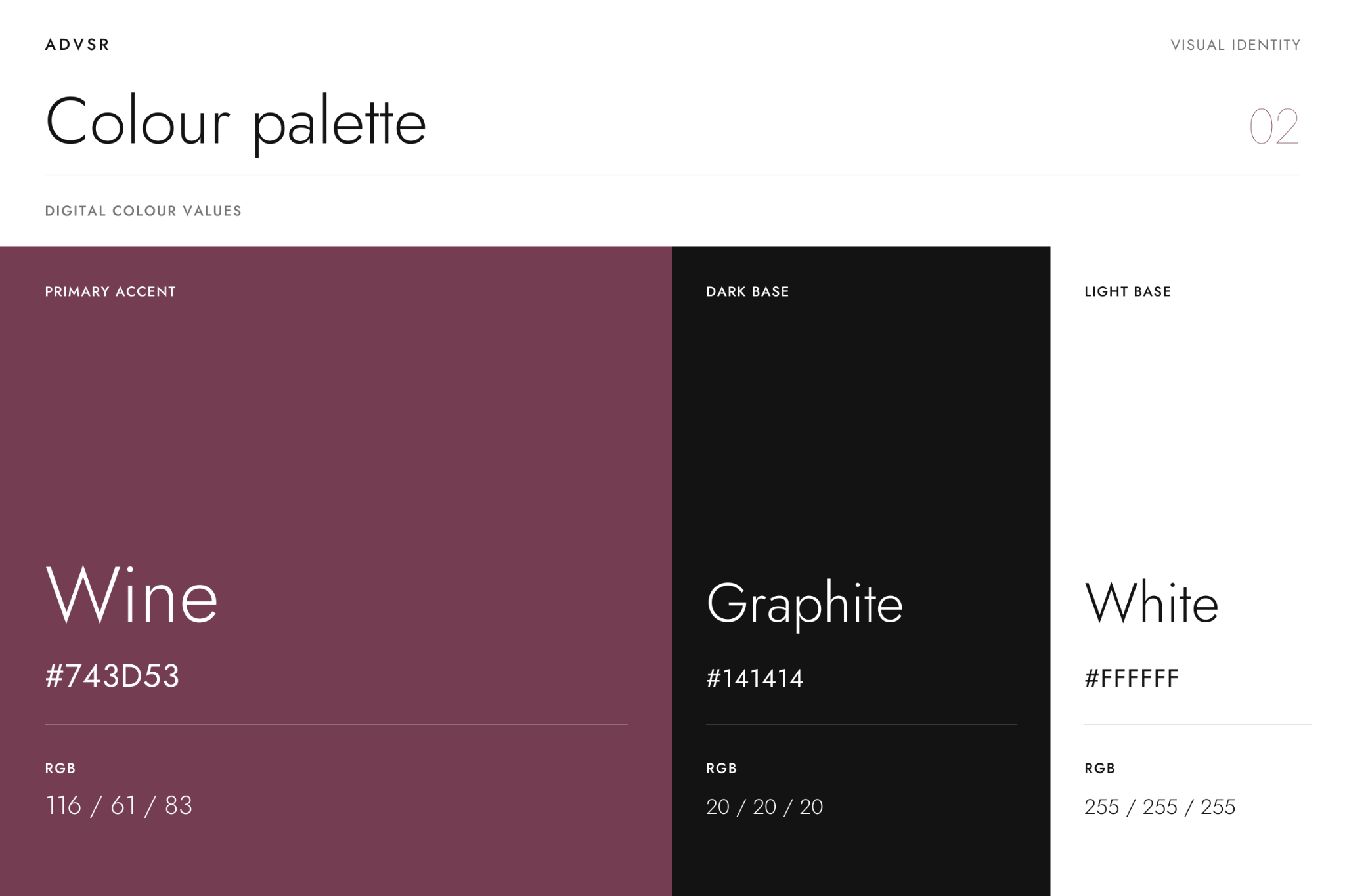
Wine gives the identity its distinctive accent. Graphite provides a composed foundation, while white creates room for information. Together, the three colours allow applications to vary in tone while remaining part of the same family.
Colour works alongside texture and proportion: a richly coloured cover, a light sheet of paper, a small branded detail. A compact palette keeps the system focused.
TYPOGRAPHY
Jost, from delicate detail to clear emphasis
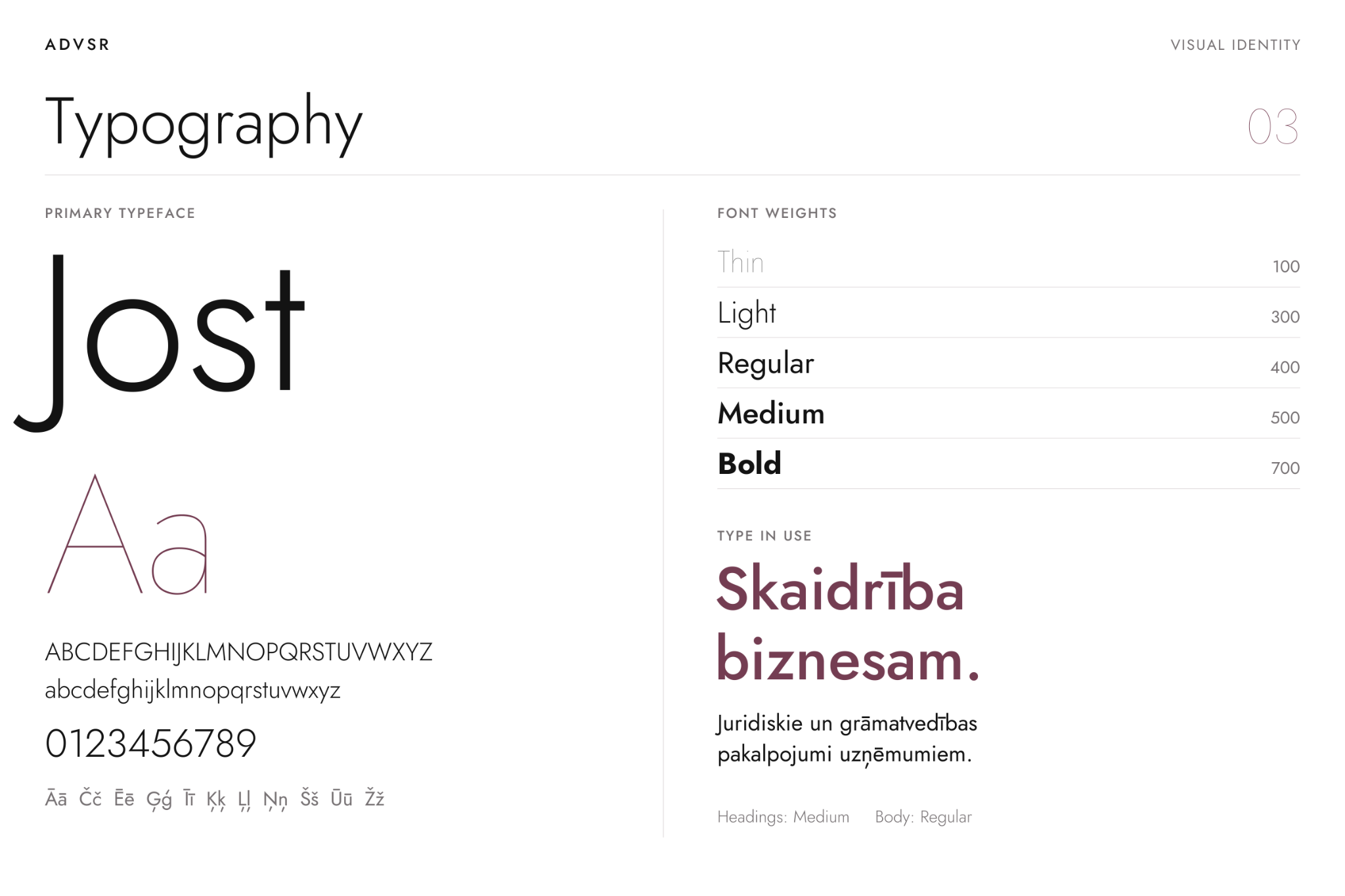
Jost’s geometric forms complement the logo. The typography presentation brings together five weights — Thin, Light, Regular, Medium and Bold — and shows how they contribute to a clear hierarchy.
Lighter weights lend character to large display text. Regular provides the reading weight, while Medium and Bold establish emphasis. Headings, short messages and information blocks can share a consistent voice.
- Jost Thin 100
- Jost Light 300
- Jost Regular 400
- Jost Medium 500
- Jost Bold 700
BUSINESS MATERIALS
An identity expressed through everyday work
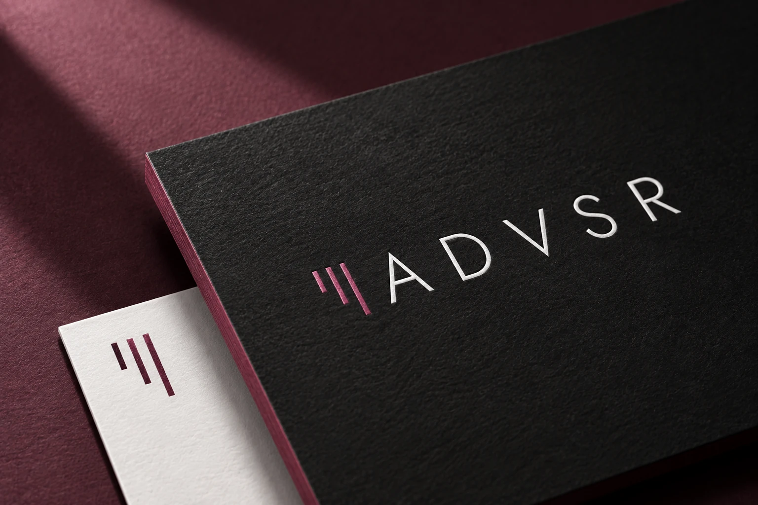
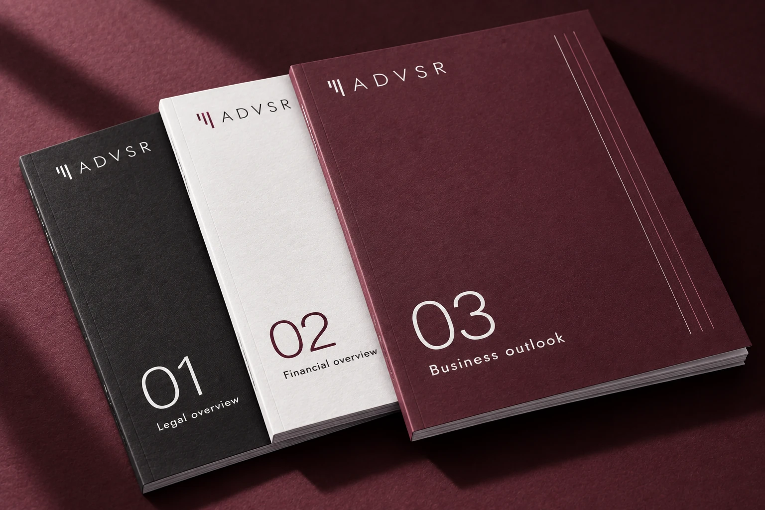
Business cards and document covers place the identity in a setting central to ADVSR’s work. The company name, the document title and generous margins form a calm, legible composition.
The concepts use paper texture, fine graphic details and the three brand colours to give even a small object a distinctive character. Report covers follow a common design principle, with colour helping distinguish one edition from another.
SPATIAL APPLICATIONS
From the object to the room
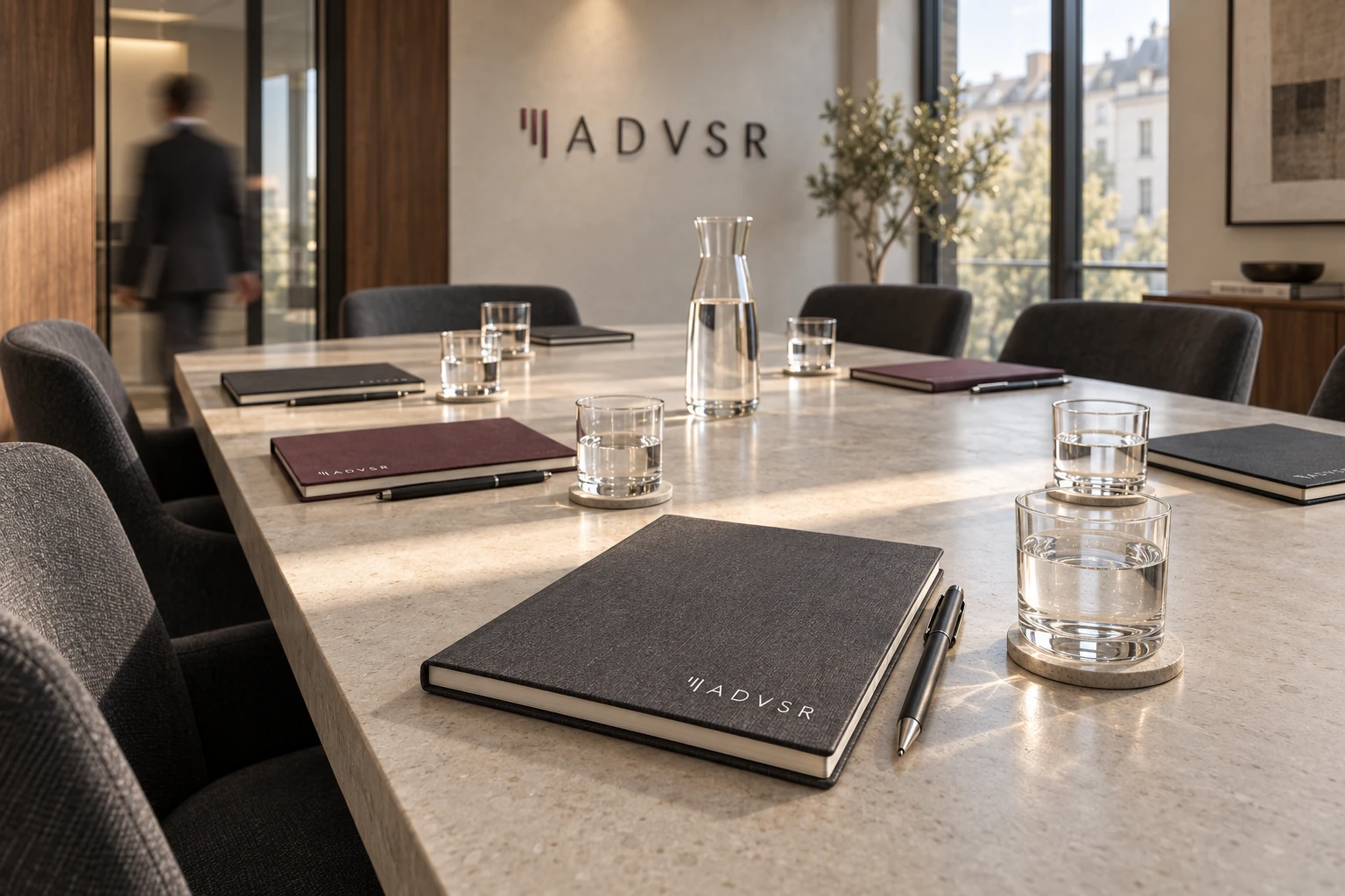
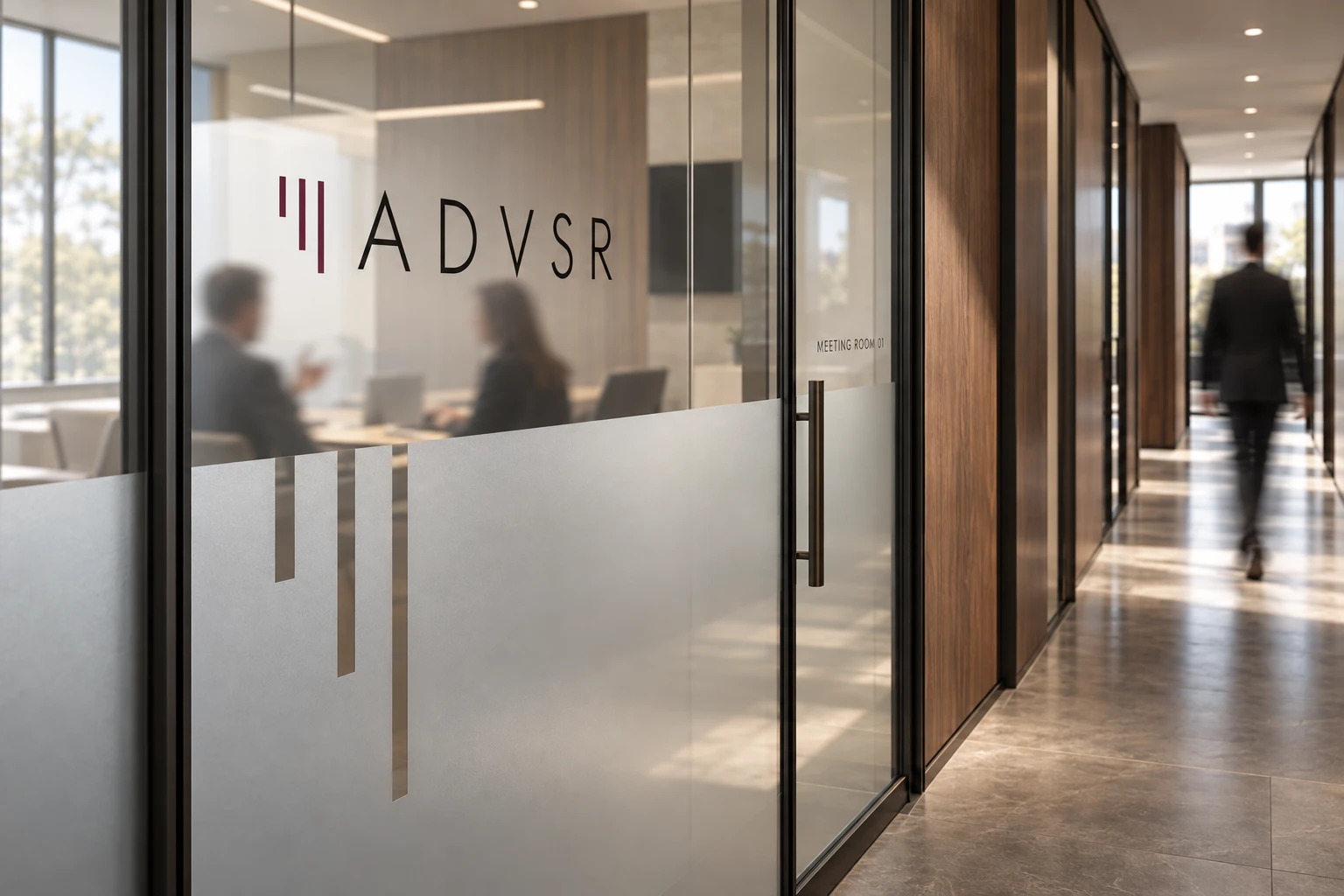
The office concepts explore the logo on a wall and a glass partition, with its vertical rhythm extended into graphics on the glass. Notebooks in the meeting room connect the wider space to the objects people use at the table.
Figures in motion and a soft sense of blur suggest an ordinary working day. The composition keeps attention on the mark’s proportions, the materials and the placement of branded details.
CLIENT COMMUNICATIONS
Consideration, made tangible
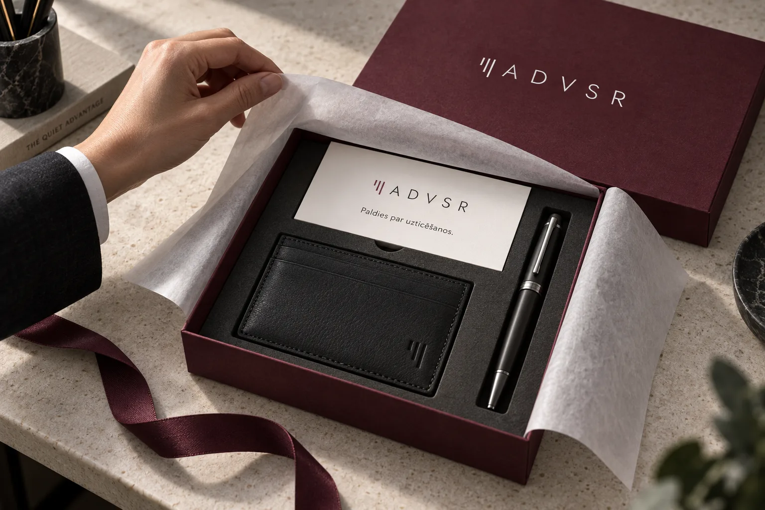
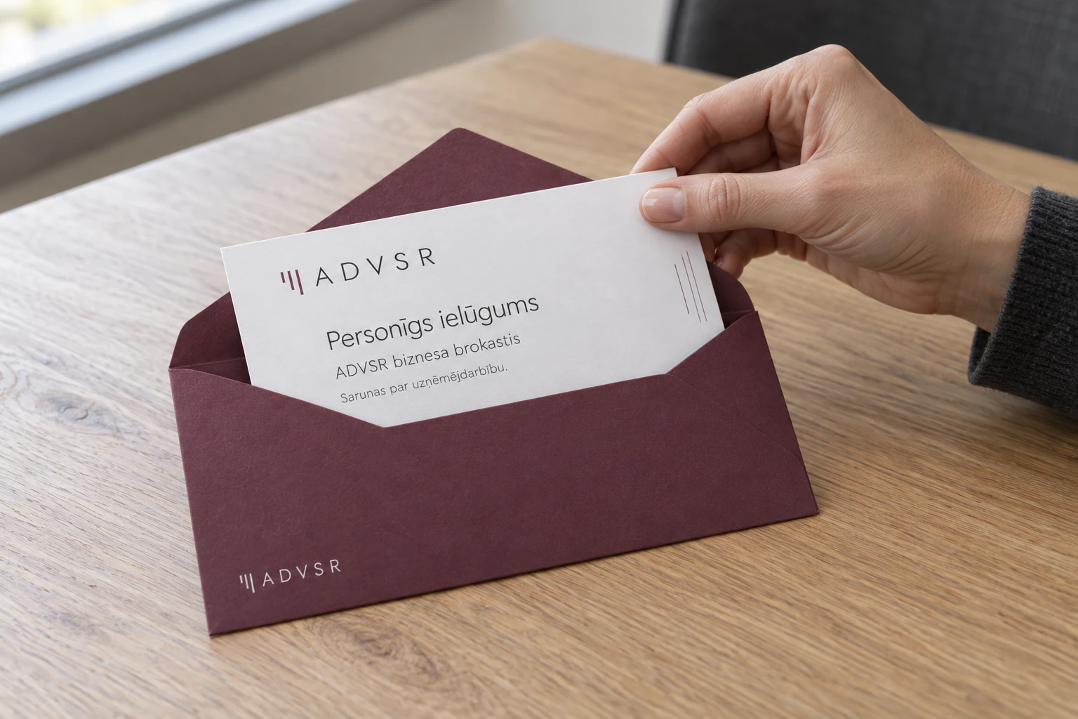
A client gift and an invitation to a private business breakfast explore a more personal expression of the brand. We considered the relationship between the outer packaging, the enclosed message and the objects inside, including the moment they are opened.
A wine envelope, a light invitation card and restrained branding create a sequence of small, considered impressions. The identity carries naturally from formal business material into a personal exchange.
DIGITAL CONCEPT
The same clarity, on screen
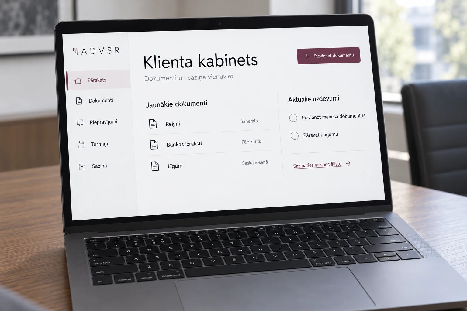
The client portal concept explores how the identity could extend into a digital interaction. A light background, wine accents and clearly separated information blocks connect the interface to the printed materials.
The mockup shows documents, messages and current tasks. It establishes a visual direction for a possible service; functional product development and launch are outside the scope of this case study.
BEYOND THE OFFICE
A quieter presence in everyday life
Padel apparel and an umbrella explore the brand in less formal settings. A small logo near the collar is enough to identify the clothing. On the umbrella, a graphite exterior and wine lining carry the colour system into a practical object.
Both applications sit within an activity: someone stepping onto a court or walking along a city street. These scenes give the identity a human context while maintaining its understated character.


PROJECT SCOPE
Guidance, applications and art direction
The project develops the presentation of the existing identity and explores its use through design concepts. The work covers:
Logo application, colour palette and typographic hierarchy.
Business cards, document and report covers, notebooks and meeting materials.
Gift packaging and a personal invitation.
Office graphics, padel apparel and a branded umbrella.
A visual concept for a client portal.
A consistent presentation of materials and moments of brand interaction.
This work includes: logo and brand identity design.
THE OUTCOME
A coherent presentation for the firm’s next stage
We brought ADVSR’s familiar elements into a connected visual narrative, from logo guidance to the identity’s presence in business and everyday settings. The result is a more mature presentation with concrete examples of how the brand can develop.
It provides a common reference for future materials. The logo, colour, typography and image direction give the team a consistent foundation as the firm continues to grow.
Has your brand presentation kept pace with your business?
Let’s discuss how to develop your identity across business materials, digital communications and the places people encounter your brand.