PROJECTS / BSL PRO
Logo and Visual Identity for Industrial Installation Specialist BSL PRO
We created the logo and visual identity for BSL PRO, a Latvian company specialising in the installation and dismantling of woodworking plants and production lines. The symbol, colours and graphics form a consistent system for corporate materials, vehicles and workwear.
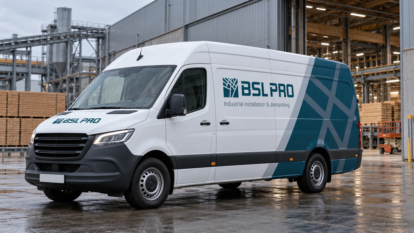
Images of vehicles, people, industrial sites and branded materials are concept visualisations of the identity in use, not photographs of completed projects or manufactured items.
- Client
- BSL PRO
- Industry
- Industrial Installation / Woodworking
- Country
- Latvia
A geometric symbol and distinctive BSL PRO lettering connect woodworking with the precision of industrial installation.
Application concepts show the identity on vehicles, workwear, equipment and temporary site facilities.
The logo, colours and graphics come together across business cards, folders and presentation materials.
ABOUT THE CLIENT
Industrial installation for the woodworking sector
BSL PRO is a Latvian company specialising in the installation and dismantling of woodworking plants and production lines. Its work centres on industrial sites, equipment and installation teams.
The identity needed to express that specialisation: a connection to woodworking, the technical nature of the work and the company’s professional approach.
THE CHALLENGE
Give the company’s expertise a clear visual expression
BSL PRO commissioned a logo and a complete visual identity. The brief called for a shared visual foundation that could work consistently in a business presentation and on an industrial site.
The identity needed to extend beyond a logo on a business card. It had to retain its character at different scales, from a small equipment label to the side of a van or a site hoarding.
OUR APPROACH
From the logo to a system of applications
We built the identity around a geometric symbol, a restrained colour palette and large-scale graphic elements. We then explored its use on materials relevant to an industrial installation company.
Logo
Created the symbol and BSL PRO lettering, combining an industry reference with precise geometry.
Visual system
Developed the digital colour palette and brand graphics, supported by a typography proposal.
Application principles
Defined a recommended logo clear space and illustrated how the identity’s elements work within layouts.
Corporate applications
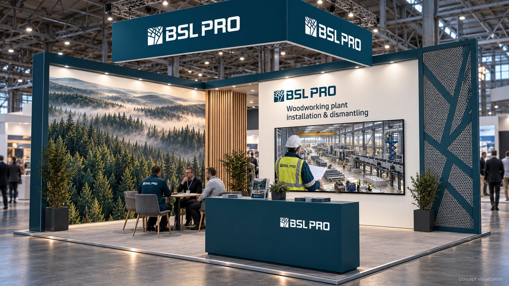
Prepared concepts for business materials, vehicles, workwear, site branding and an exhibition stand.
VISUAL CONTEXT
Woodworking is the sector. Installation is the specialism.
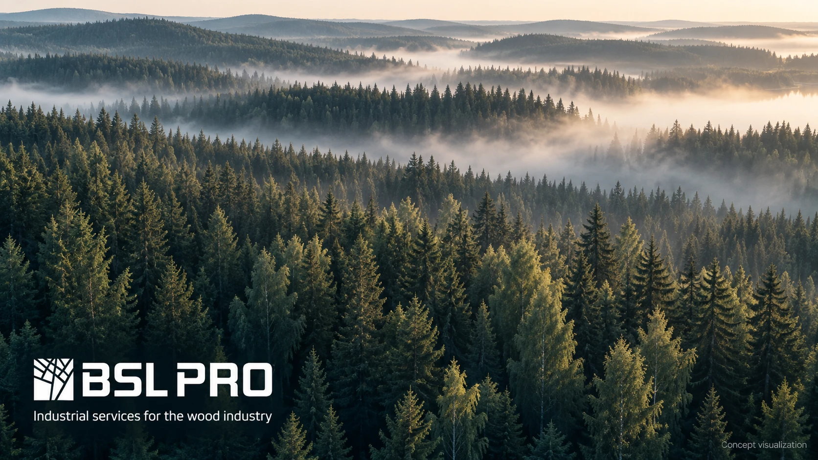
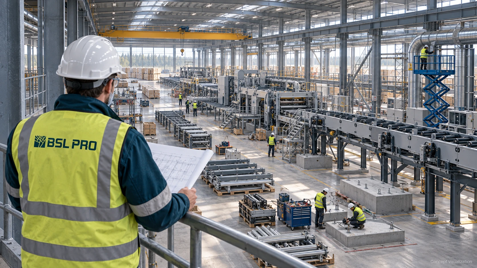
The presentation brings together two visual settings: forest landscapes and industrial sites. The first establishes the sector; the second explains BSL PRO’s role in installing equipment and production lines.
The company’s visual presentation therefore goes beyond timber alone. Structures, tools, machinery and people carrying out technical work are part of the story.
LOGO & BRAND GRAPHICS
A connection between tree forms and structures
The logo pairs a compact geometric symbol with prominent BSL PRO lettering. Its branching lines suggest a tree, while the intersections and angles echo the structures associated with installation work.
The same graphic principle extends beyond the logo. Enlarged linear fragments appear on vehicles, folders, equipment and spatial applications.
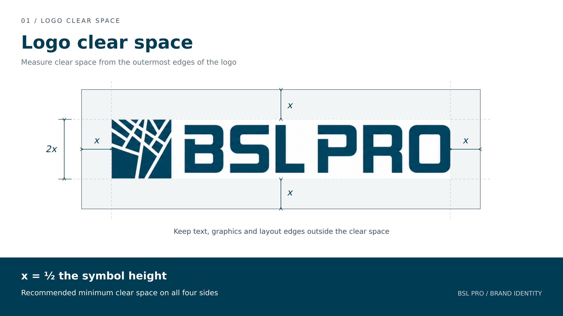
The application diagram sets out recommended clear space on all four sides. The unit x equals half the height of the symbol. Text, graphics and layout edges should remain outside this area.
x = ½ the symbol height; allow x on all four sides.
BRAND COLOURS
A restrained palette with an industrial character
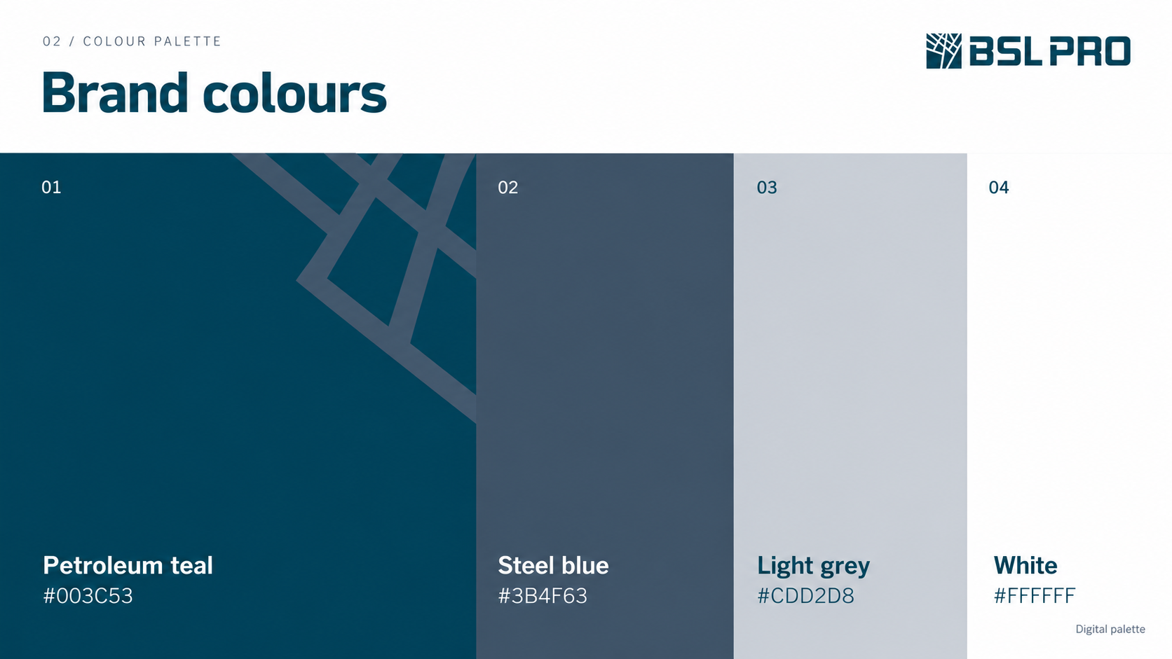
Deep petroleum teal anchors the identity. Steel blue supports the graphics, while light grey and white provide backgrounds, text colours and contrasting combinations.
The palette allows light and dark surfaces to vary without losing the overall visual character. The presentation specifies digital colour values.
TYPOGRAPHY
Clear headings and technical labels
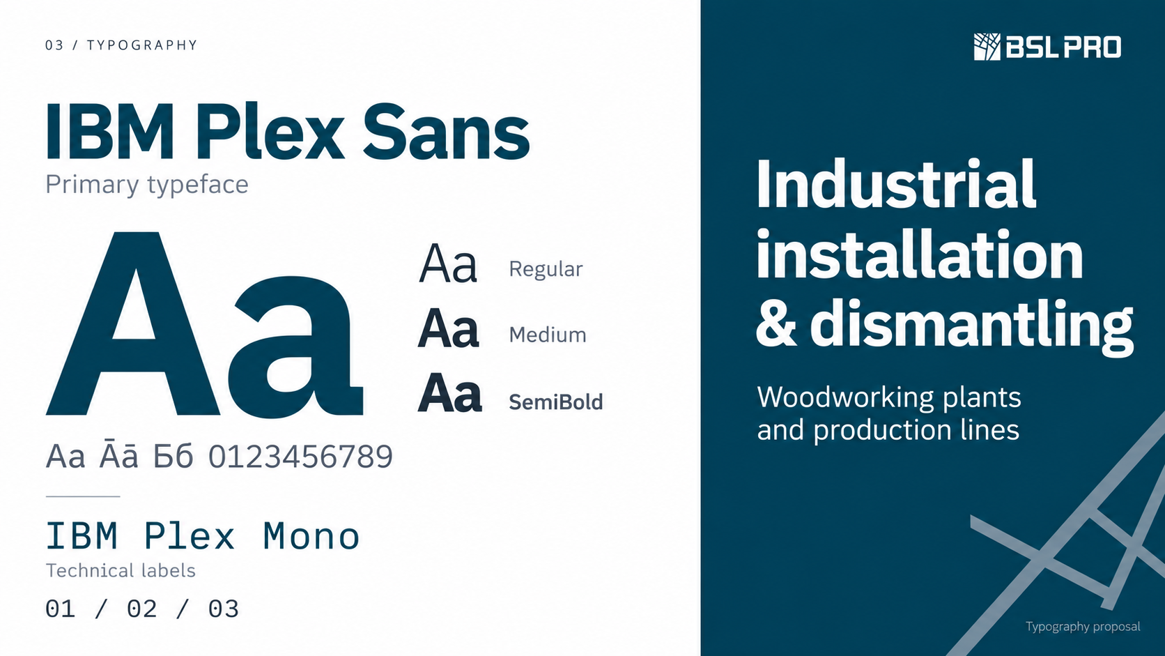
The typography proposal pairs IBM Plex Sans in Regular, Medium and SemiBold weights with a clear hierarchy for headings, service descriptions and body text.
IBM Plex Mono is proposed for numbering and technical labels. This distinction helps organise information while reinforcing the visual system’s engineering character.
Typography proposal
BUSINESS MATERIALS
An identity for presenting the company
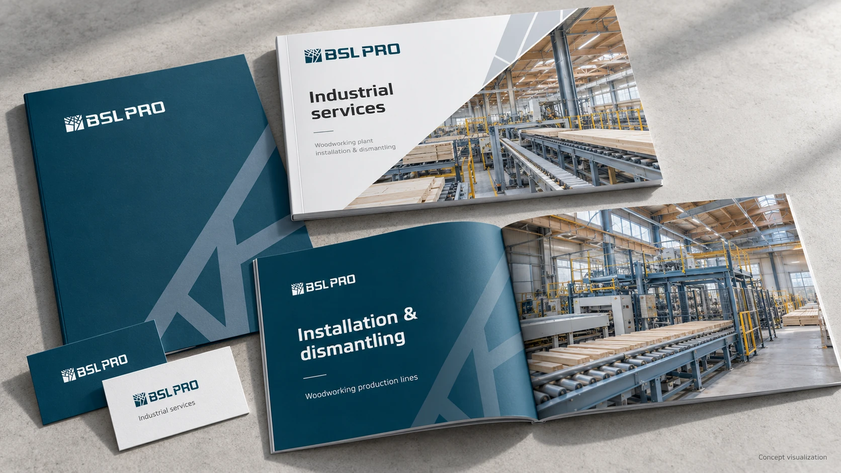
The business card, folder and brochure concepts combine the logo, brand colour blocks and industrial imagery. The graphics connect the materials, while the headings state the specialisation directly: installation and dismantling of woodworking plants and production lines.
These layouts demonstrate a consistent way to introduce the company’s services, from a first meeting to a detailed presentation.
WORKWEAR
The identity in the team’s everyday environment
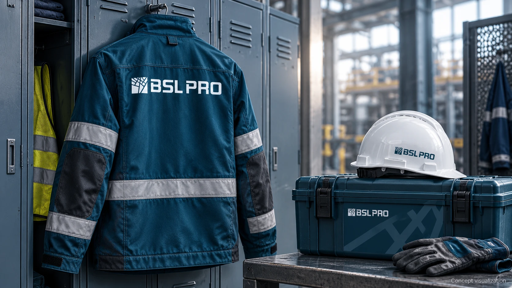
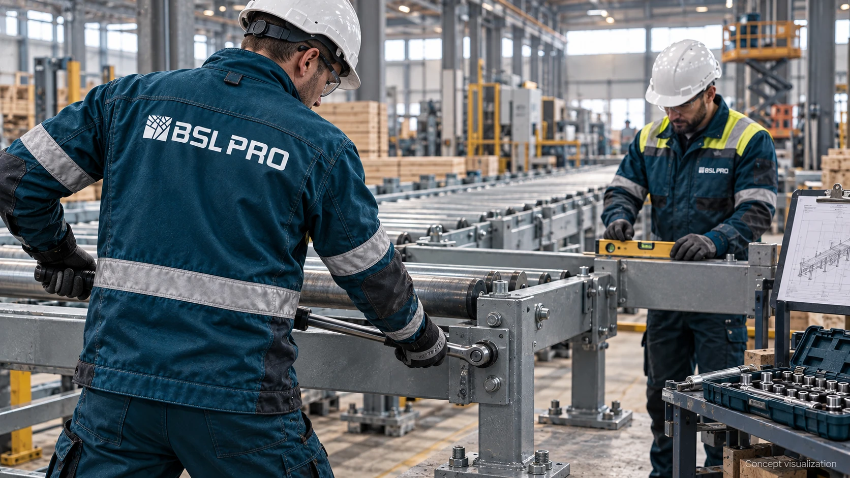
The visualisations explore logo placement on jackets, hard hats and tool cases. Large applications across jacket backs and more compact versions on smaller items demonstrate different uses of the mark.
The working environment is part of the identity presentation. Rather than showing branded items only against a neutral backdrop, the concepts place them alongside equipment, tools and production lines.
SITE BRANDING
One visual system for the site office and hoarding
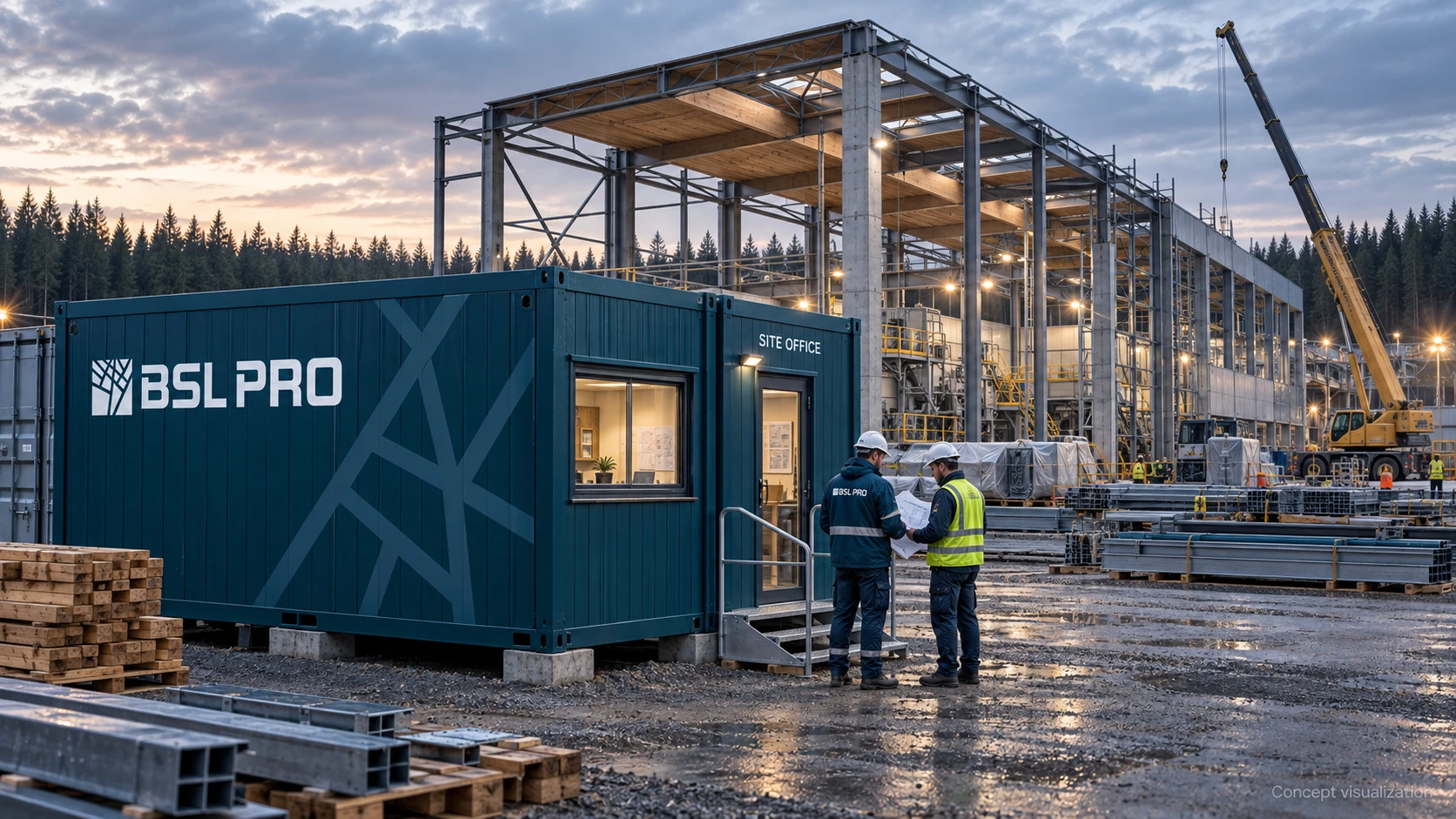
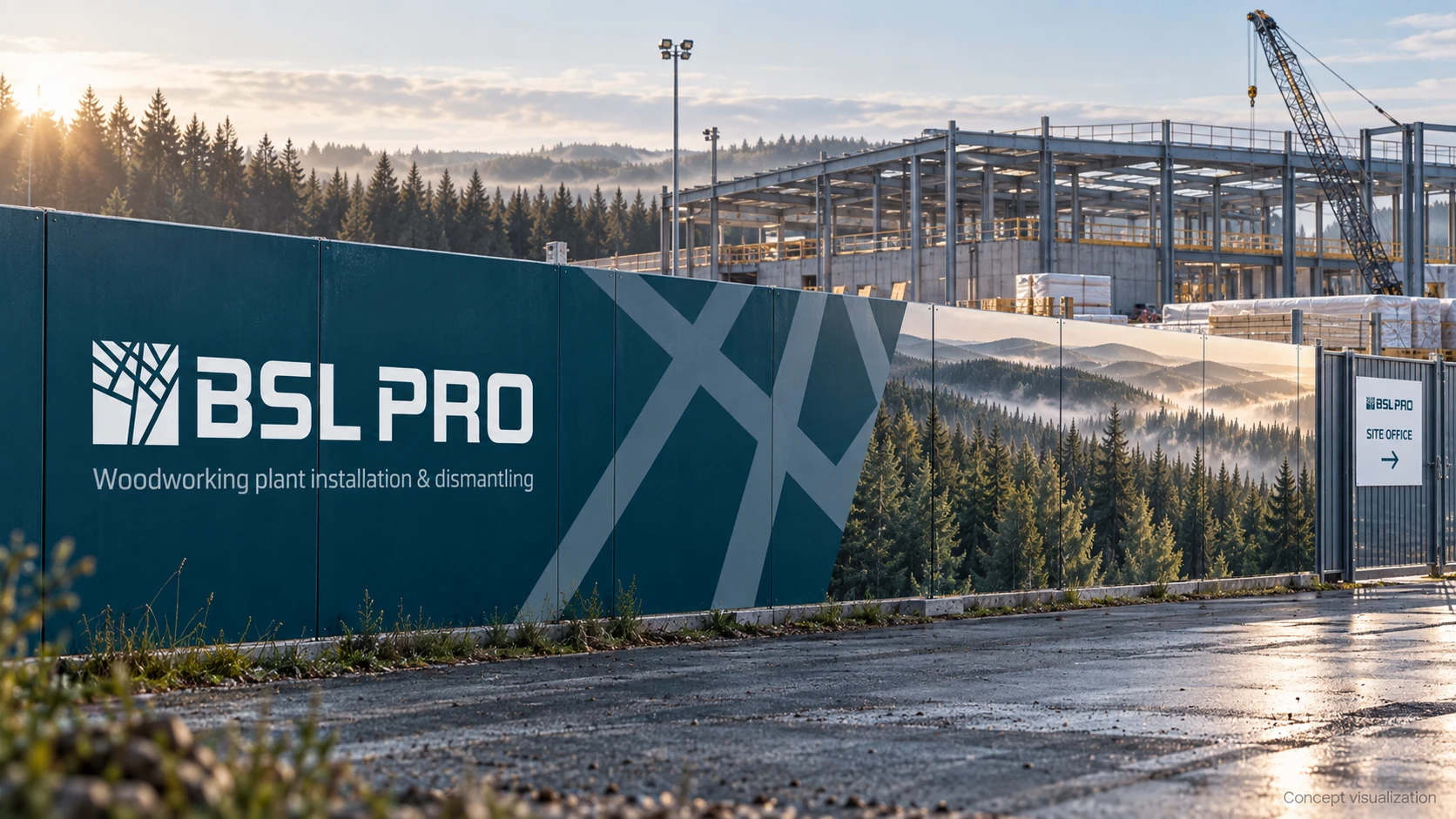
The site concepts take the identity into larger formats. The temporary office gives the logo a prominent role, while the hoarding combines it with a service description, brand graphics and industry-related imagery.
Directional signs add a practical function by identifying the office and the route towards it. The shared system connects these applications to the vehicles and the team’s workwear.
EQUIPMENT IDENTIFICATION
Graphics that help organise information
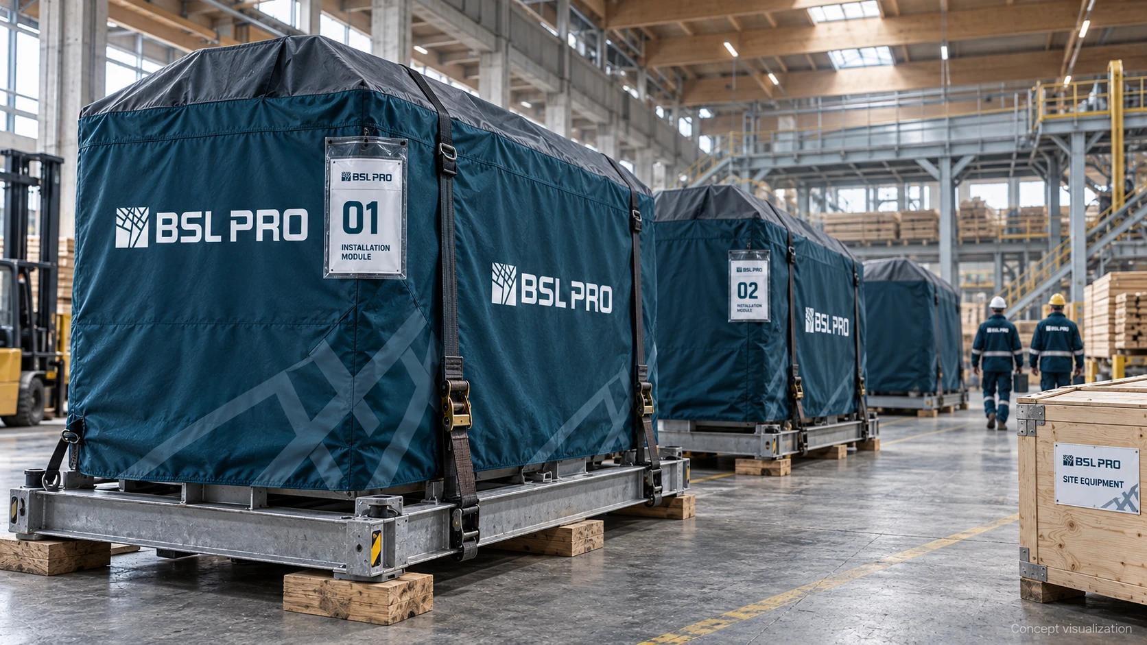
The protective cover and equipment crate concepts combine the logo, brand lines and numbered labels. The identity supports clear identification of individual modules.
The focus is on consistency rather than decoration alone: the company name, number and item description each have a defined place in the layout.
EXHIBITION APPLICATION
The same identity in a space for business meetings
The exhibition stand concept brings together the logo, large geometric graphics and imagery of forests and industrial installation. A direct service description introduces the company’s specialism, with a presentation area providing space to explain it further.
This application completes the range: from a small business card to a spatial concept, the brand retains a shared palette, graphic language and character.
WHAT WE DELIVERED
A logo, visual identity and corporate application concepts
The core project was the BSL PRO logo and visual identity. Application concepts demonstrate how the system can extend into business communications and the working environment.
- Logo symbol and BSL PRO lettering
- Digital colour palette
- Brand graphics based on the symbol
- Recommended logo clear-space diagram
- Typography proposal: IBM Plex Sans and IBM Plex Mono
- Business card, folder and corporate brochure concepts
- Service vehicle branding concept
- Workwear, hard hat and tool case branding concepts
- Site office, hoarding and directional signage concepts
- Protective cover and equipment identification concepts
- Exhibition stand concept
This work includes: logo and brand identity design.
OUTCOME
A consistent identity for an industrial installation company
BSL PRO gained a logo and visual identity connected to its specialisation. The symbol, palette and graphics provide a shared foundation for corporate materials and future brand applications.
The project demonstrates how one identity can represent the company consistently across a business presentation, workwear, vehicles and an industrial site.
Need a visual identity for your company?
Tell us about your business and the brief. We’ll discuss the logo, visual identity and applications your team needs.