Branding and Visual Identity for Vegetable Oil Exporter Laviola
We created Laviola’s logo, visual identity and packaging design, then carried the new identity through to its corporate website. The project established a consistent visual language for a B2B vegetable oil supplier, from brand graphics to business communications.
- Client
- Laviola
- Industry
- Vegetable Oil Wholesale & Export
- Website
- laviola.lv
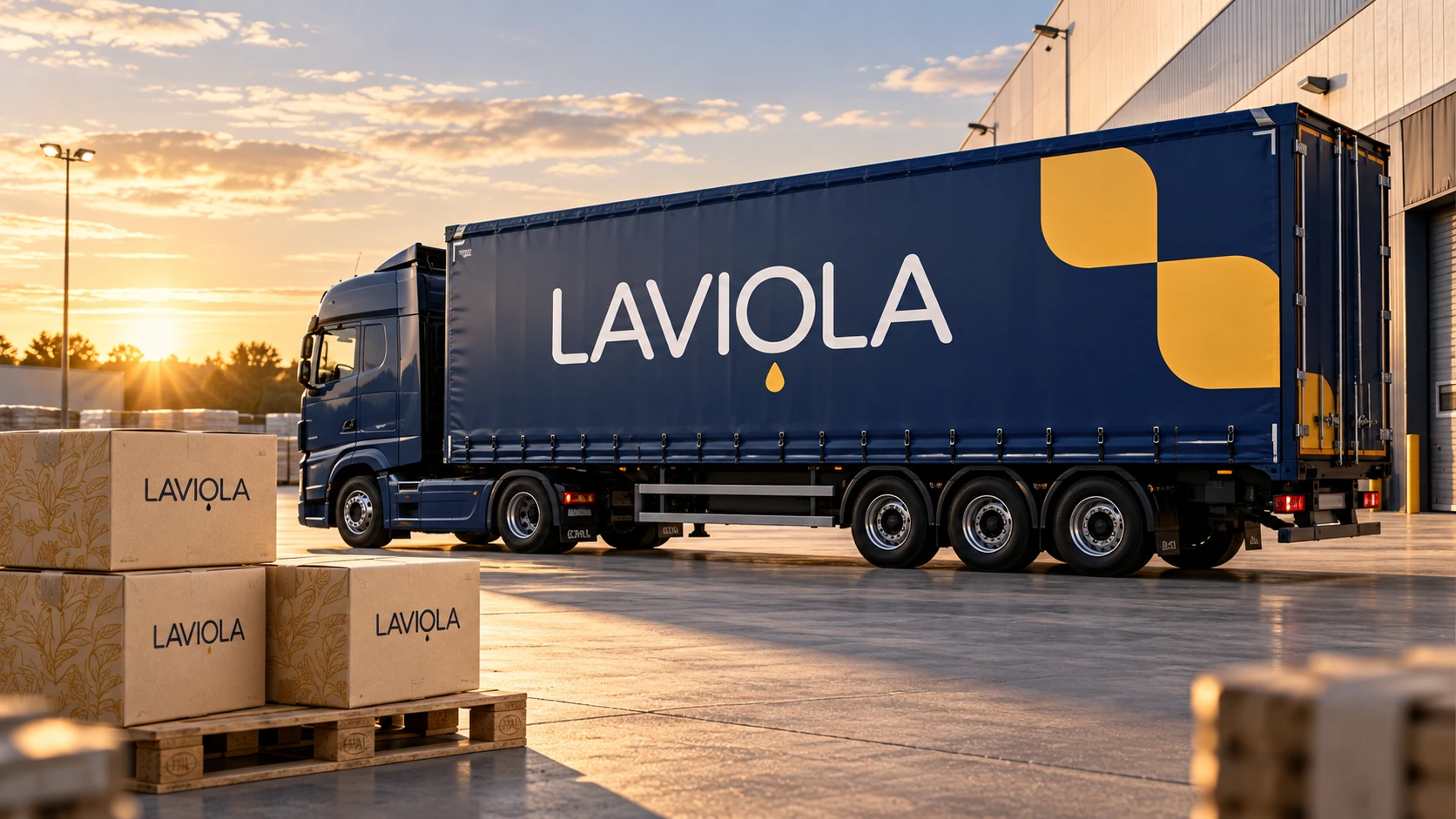
This page features visualisations of the identity in use. Vehicles, spaces, the exhibition stand and social media mockups are design concepts, not photographs of completed installations or published campaigns.
A logo, colour palette and brand graphics brought together in a consistent visual system.
We applied the identity to packaging and explored its use across corporate materials.
We carried the visual identity into a corporate website presenting the company, its products and supply information.
About the client
Laviola — a vegetable oil supplier for the B2B market
Laviola is a Latvian company specialising in the wholesale trade and international supply of vegetable oils. Its range includes rapeseed oil, sunflower oil, rapeseed meal and sunflower meal.
The company works with professional buyers and trade partners. The identity therefore needed to represent more than a product on a retail shelf: it had to represent a business with which buyers discuss product ranges, volumes and supply terms.
The challenge
Creating an identity that reflects the business
Laviola approached us to develop its visual identity across the business, from the logo and brand graphics to packaging and the website. The project needed a shared visual foundation so that each application felt connected rather than designed in isolation.
The focus was B2B communication. We sought a balance between a clear link to plant-based products and a restrained corporate identity suited to international business relationships.
Our approach
Identity first. Applications next. Then the website.
We worked from the core elements outwards. First came the logo and visual system, followed by packaging and brand applications. The corporate website was an extension of that work, not the starting point.
We created the Laviola wordmark and connected it to the product through a simple droplet symbol.
We brought the colour palette, geometric graphics and botanical pattern together in one system.
We developed the packaging design and prepared visualisations of the identity across different formats.
We applied the identity to the website interface and the presentation of the company and its products.
Logo design
A simple wordmark with a clear product connection
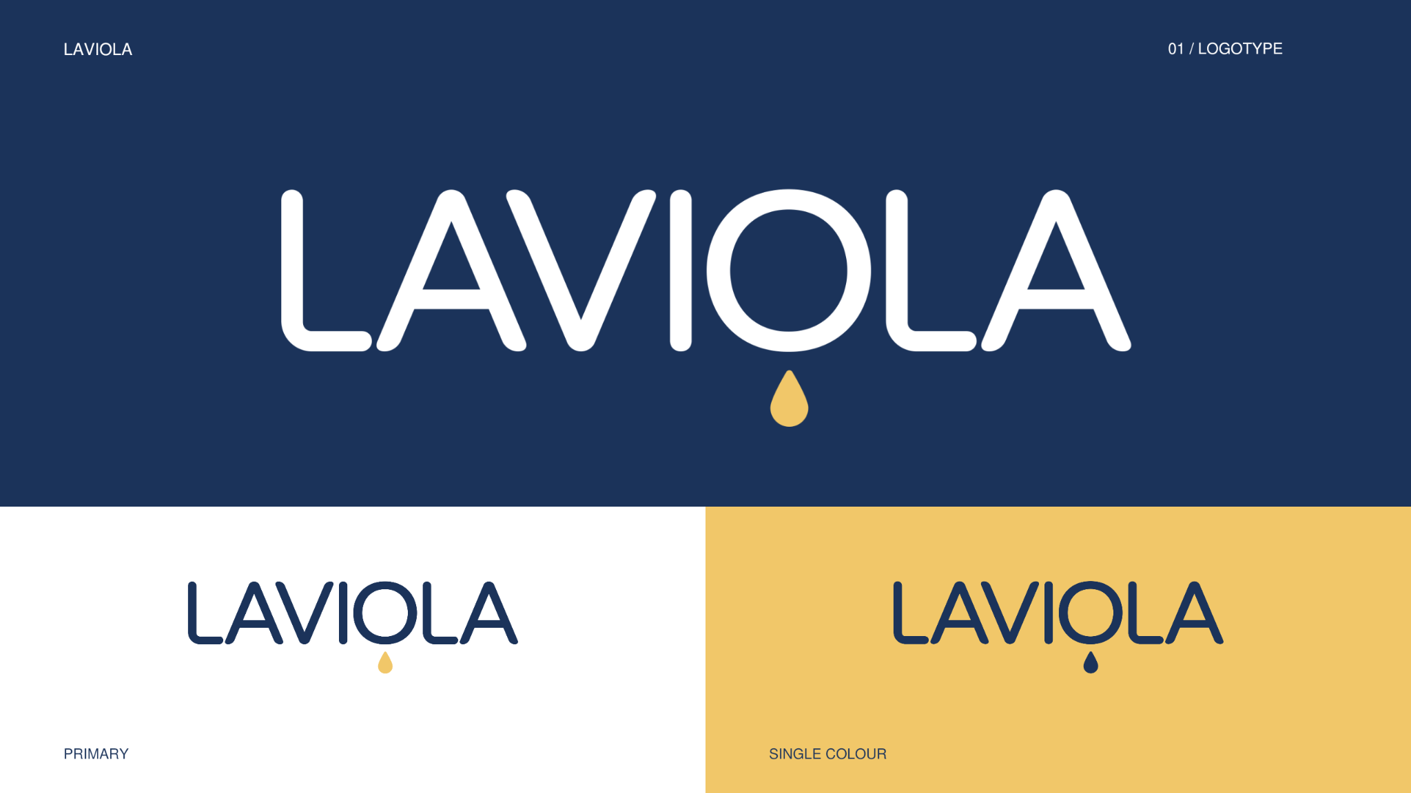
The logo centres on the Laviola name, with rounded letterforms. A small droplet beneath the O connects the mark to vegetable oils without adding unnecessary symbolism.
The presentation shows the logo on navy, white and yellow backgrounds. These variations provide a foundation for using the mark consistently across different materials.
Brand colours
A navy foundation with a warm yellow accent
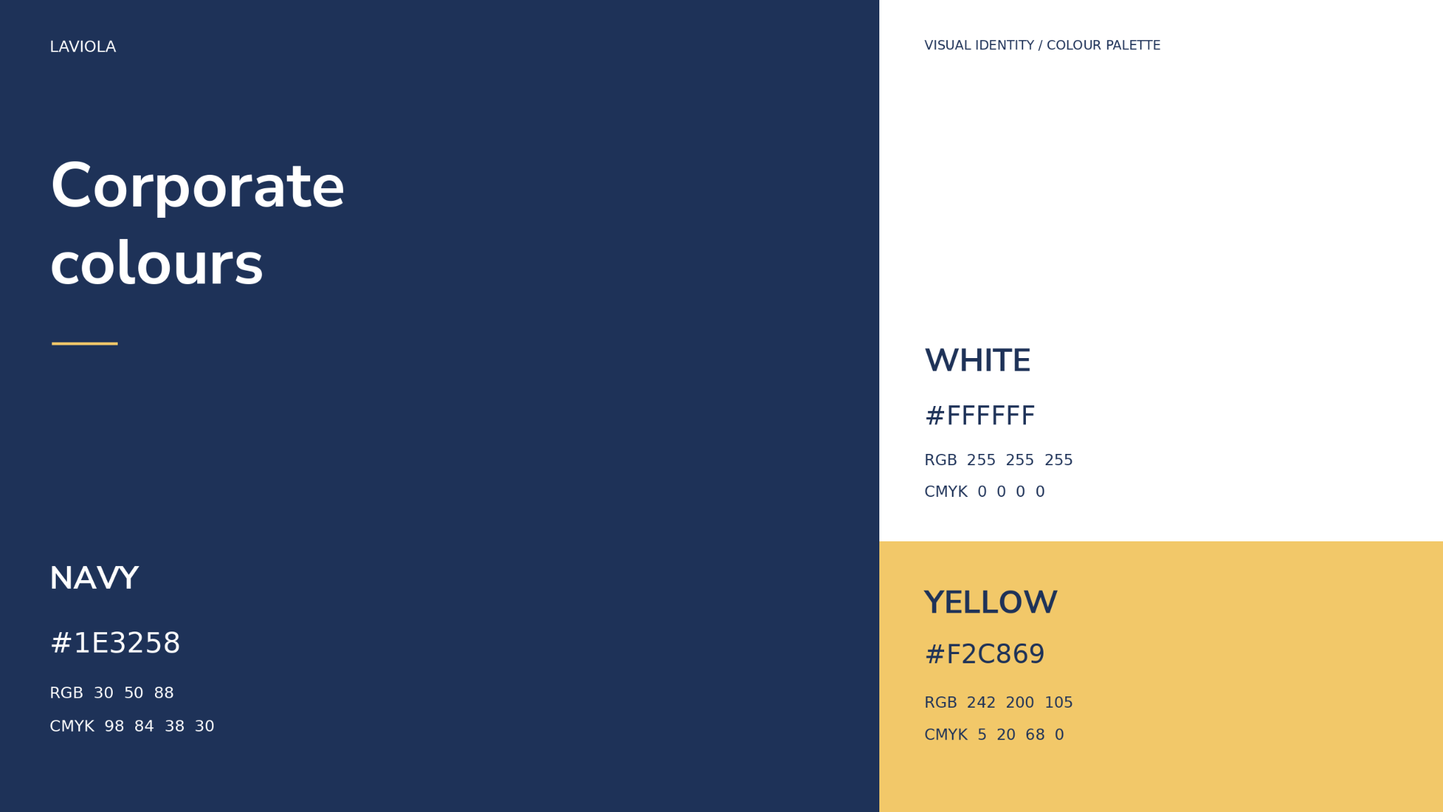
The palette uses three colours. Navy anchors the corporate materials, white gives text and product imagery room to breathe, and yellow highlights the droplet and brand graphics.
The combination relies on contrast: the restrained base maintains a businesslike tone, while the warm accent echoes the colour of oil.
Graphic system
Two patterns, different expressions of one identity
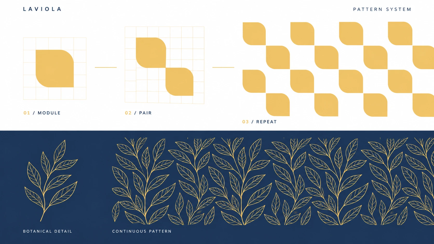
The geometric pattern starts with a rounded-corner module. Depending on the format and purpose, it can appear as a single accent, a pair of elements or a repeating composition.
The second element is a botanical line pattern. It adds detail and references the plant-based origins of the products. Together, the two approaches allow variety while preserving the character of the brand.
Packaging design
An identity that extends beyond the logo
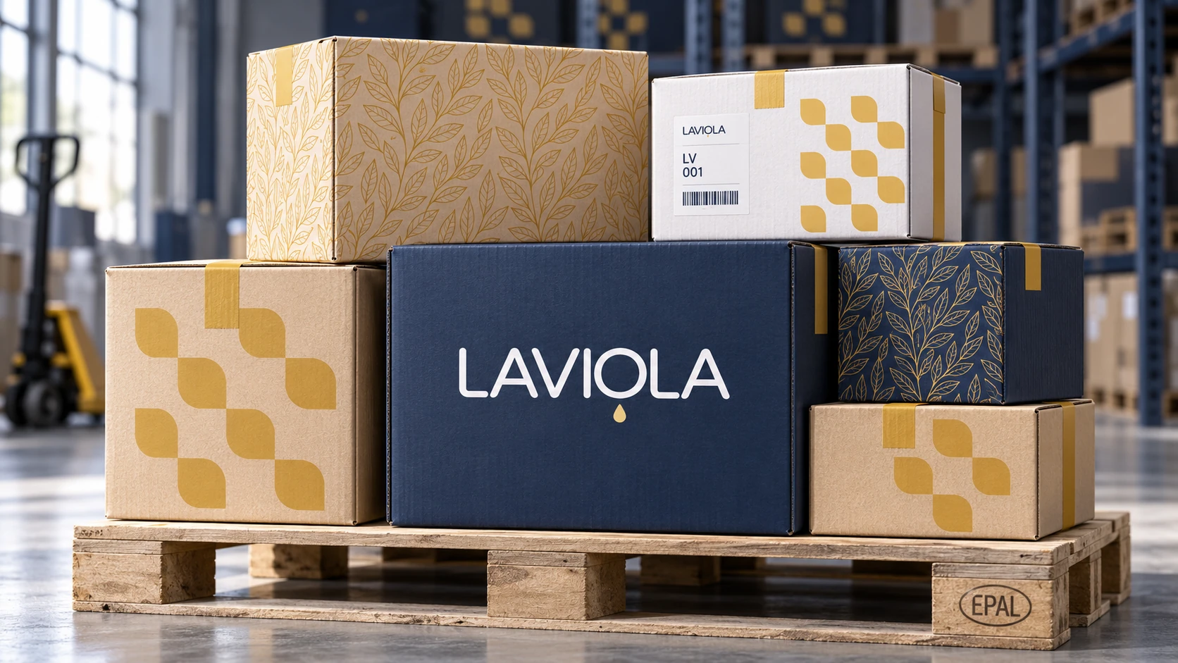
The packaging combines the logo, blocks of colour and both patterns. Some versions use the contrast between navy and white; others pair yellow graphics with the texture of cardboard.
The visualisations show how the same identity can work across packaging formats: where a prominent logo is enough, and where pattern and composition take a greater role.
Corporate applications
One visual language at different scales
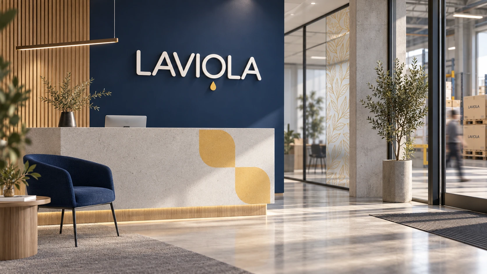
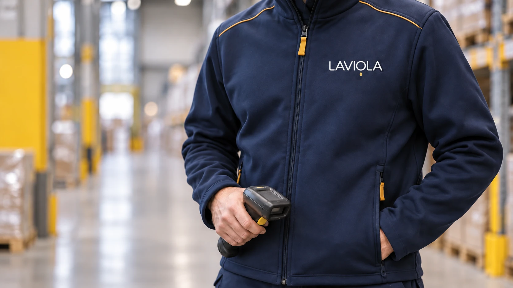
To demonstrate the scope of the identity, we prepared design concepts for vehicles, workwear and corporate spaces. At a larger scale, the logo and colour accents lead the composition; on smaller applications, careful placement and restrained detail become more important.
These are examples of the identity in use, not separate construction, interior design or manufacturing projects.
Spatial applications
Bringing the identity into an exhibition stand
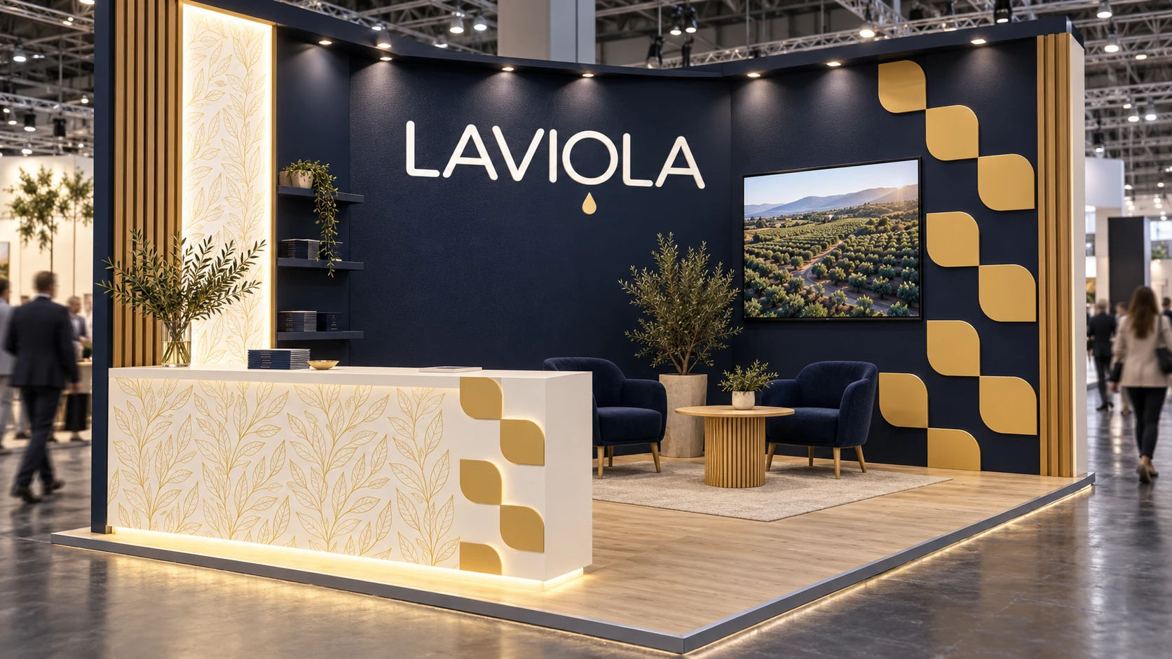
The stand concept shows how the visual system can translate into a physical space. The logo becomes the focal point, geometric graphics provide accents, and the botanical pattern adds detail.
The visualisation brings these elements together in a concept for company presentations and business meetings.
Social media concepts
B2B communication with the product in focus
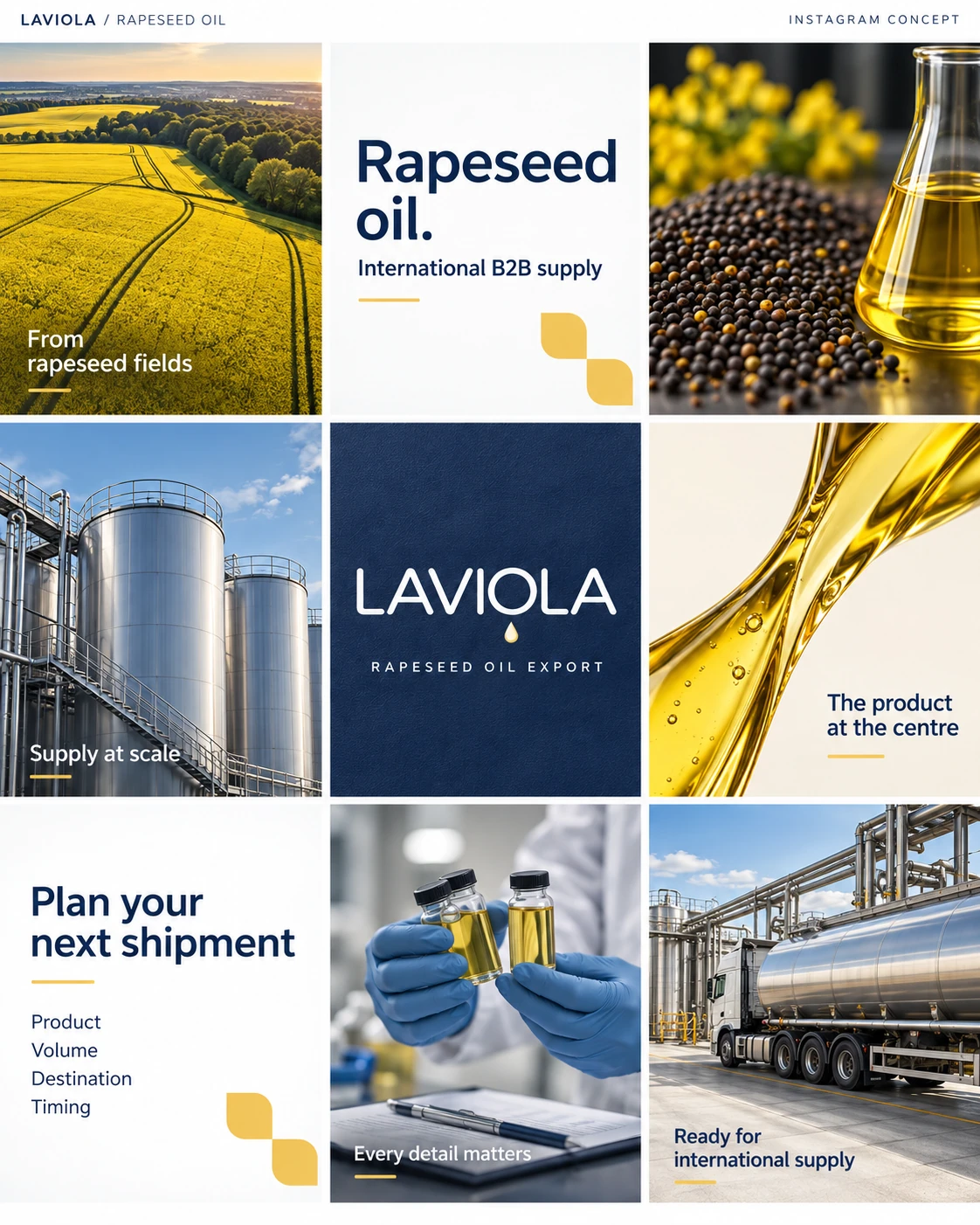
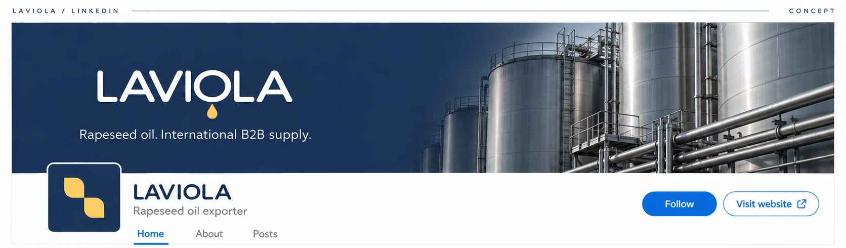
We developed Instagram and LinkedIn design concepts focused on rapeseed oil and international supply. The visual direction centres on the product, samples, logistics and the information needed to start a business conversation.
Photographic compositions alternate with typographic posts and brand graphics. The messages stay specific: which product is needed, in what volume, for which destination and by when.
The case study presents design concepts, not the results of social media management or advertising campaigns.
Corporate website
The next stage of the branding project
Once the identity was established, we created Laviola’s corporate website. The visual system shaped its design, while the structure brought together information about the company, its products, logistics and contact details.
Visitors can explore the range of vegetable oils and oilseed meals, read about supply and contact the company. The website extends the identity and maintains the same business-focused presentation.
Visit the Laviola websiteWhat we delivered
From logo design to the corporate website
The core project covered the logo, visual identity, packaging design and website. Application visualisations and social media concepts demonstrate how that system can be used in the company’s communications.
- 01Logo design and usage variations
- 02Colour palette and visual system
- 03Brand graphics and patterns
- 04Packaging design
- 05Corporate website design and development
Vehicles, workwear, corporate spaces and an exhibition stand.
Instagram and LinkedIn designs focused on B2B rapeseed oil supply.
This work includes: logo and brand identity, website development.
The outcome
A cohesive identity for an export business
Laviola received a logo, visual identity, packaging design and corporate website connected by one visual system. Rather than a collection of separate designs, the company gained a foundation for presenting its materials and communicating with partners consistently.
The key result is not the number of applications, but their consistency: packaging, corporate materials and the website all represent the same brand.
Does your business need a visual identity?
Tell us about your business and what you need — let’s discuss your logo, visual identity, packaging and website as parts of one project.