CASES / PAYCONA
Paycona: Brand Identity and SaaS Platform Design
Juice Digital Agency developed a complete brand and digital product design concept for Paycona. We brought together the logo, visual identity, website direction and SaaS platform interfaces to create a consistent experience across communication and product.
The central idea, Payments connected, expresses the relationship between people, businesses and the payments that connect them.
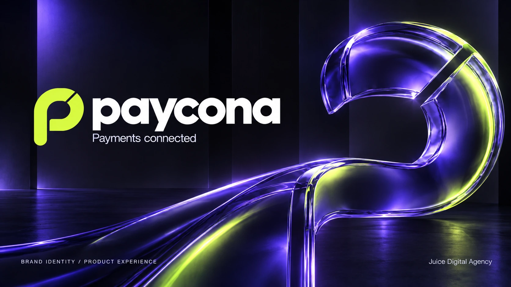
This case presents a brand and product design concept. Product screens use sample data.
- Client
- Paycona
- Industry
- Fintech and payments
- Project scope
- Brand and product design concept
CHALLENGE
The challenge
Payment brands need to be recognisable in their communication and clear in their interfaces. Our task was to bring these qualities together. Paycona needed a distinctive visual character that could work on a campaign poster, a business card and a screen used to manage payments.
We designed the identity and product experience as parts of the same system. Colour, typography and graphic elements support the brand, while the interface gives priority to information and the next action.
IDEA
The idea
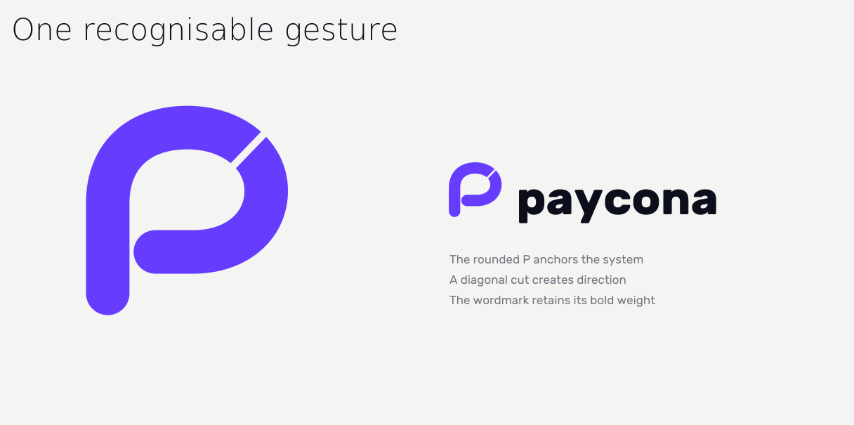
We built the design around clarity and connection. The rounded P became the starting point for the visual language. Its continuous shape suggests movement, while the diagonal cut gives the mark a distinct direction.
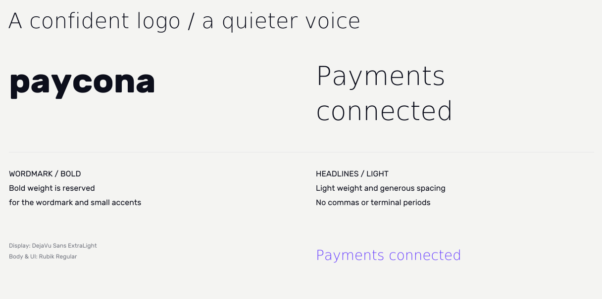
The brand line Payments connected carries this idea into communication. A bold wordmark is balanced by lighter headlines and generous spacing, giving the identity a confident but approachable voice.
IDENTITY
Logo and visual identity
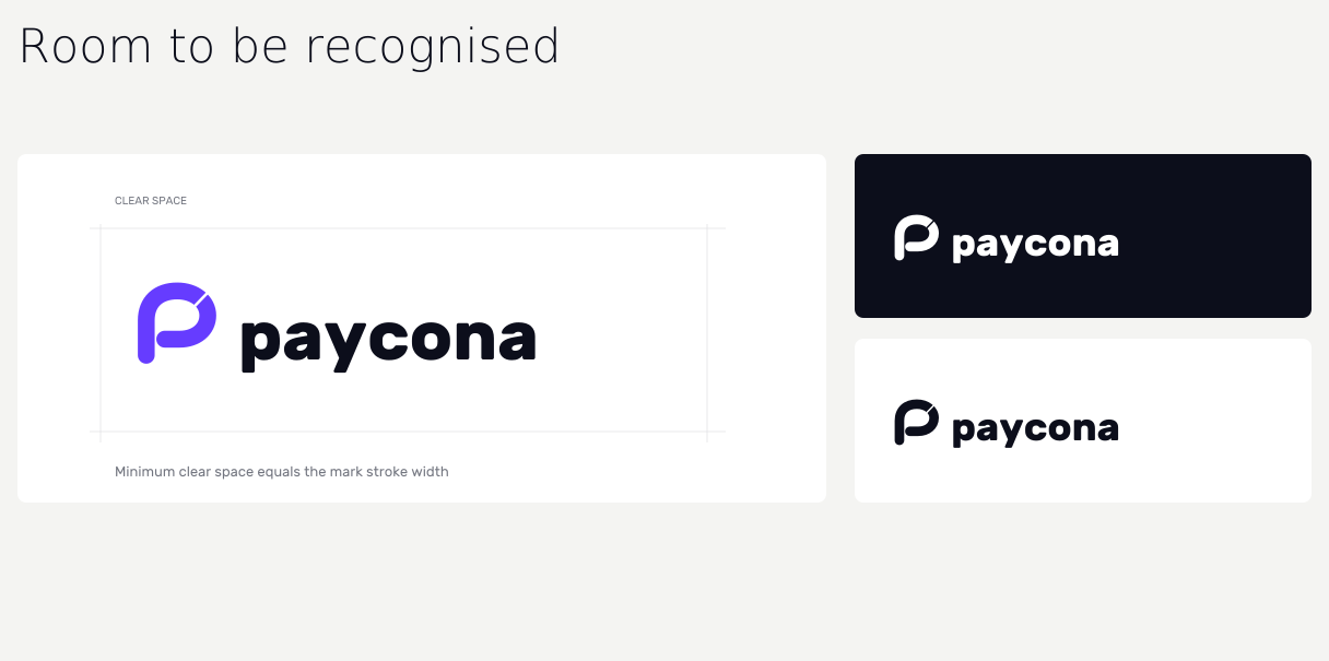
We developed the logo, its colour variations, clear space principles and application across different backgrounds. The P also works independently as an app icon and a recognisable detail on physical materials.
COLOUR AND GRAPHICS
Colour and graphic language
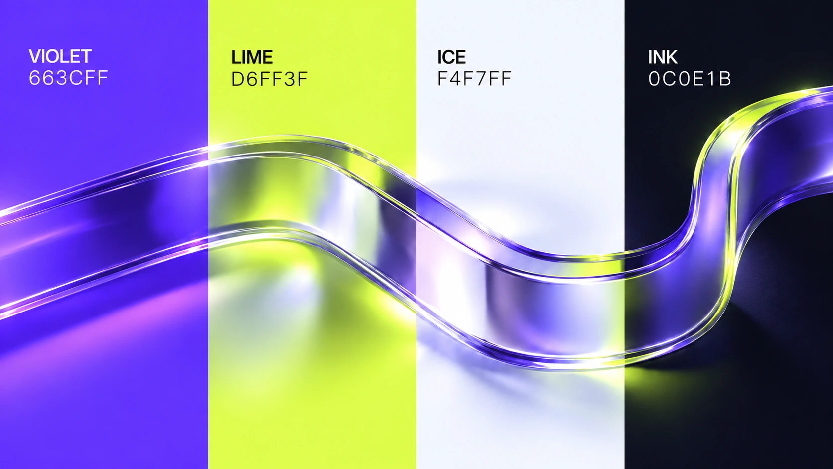
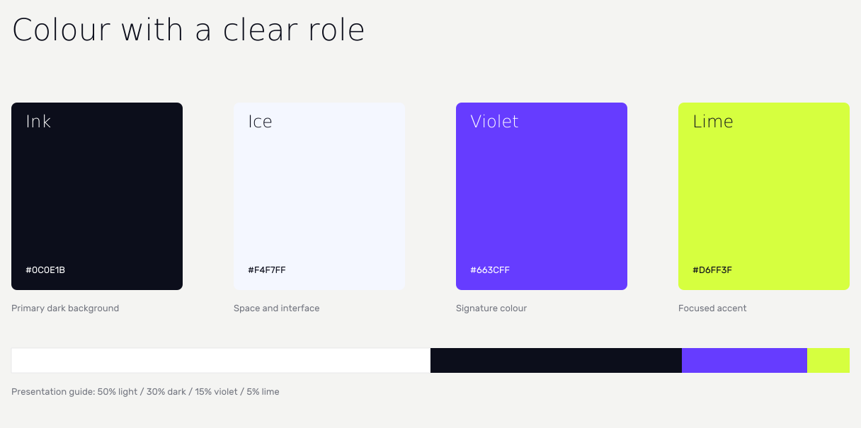
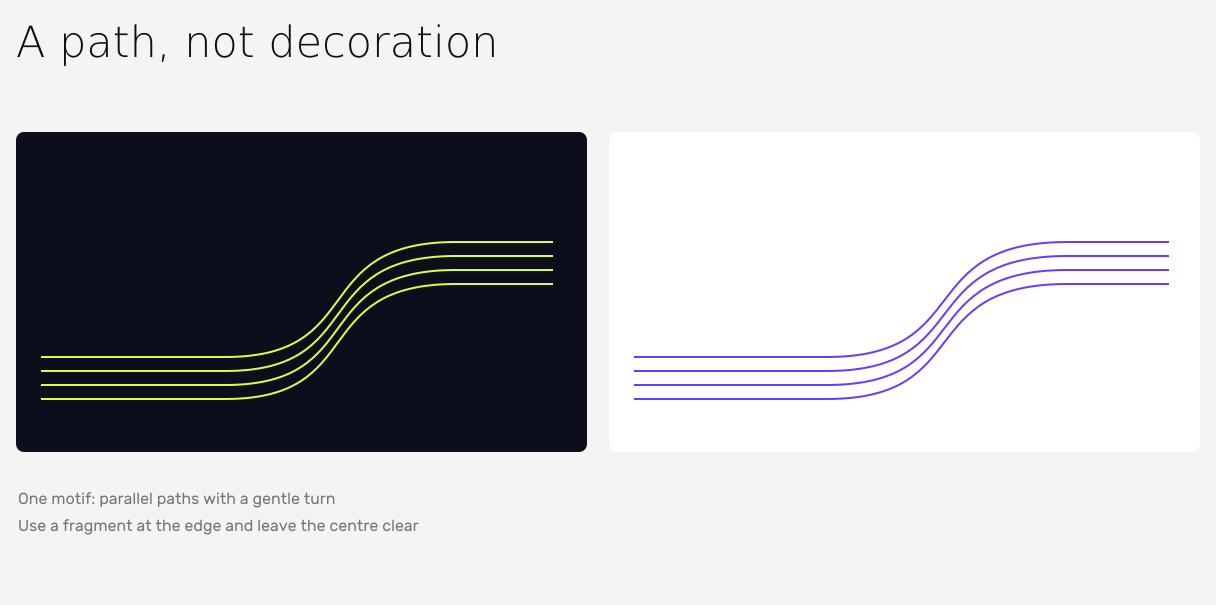
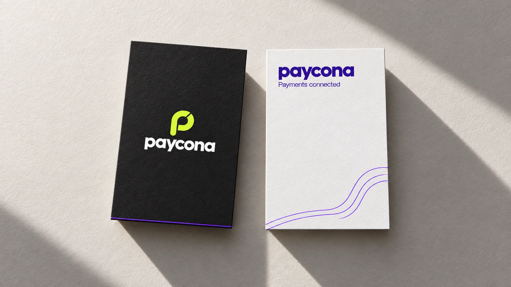
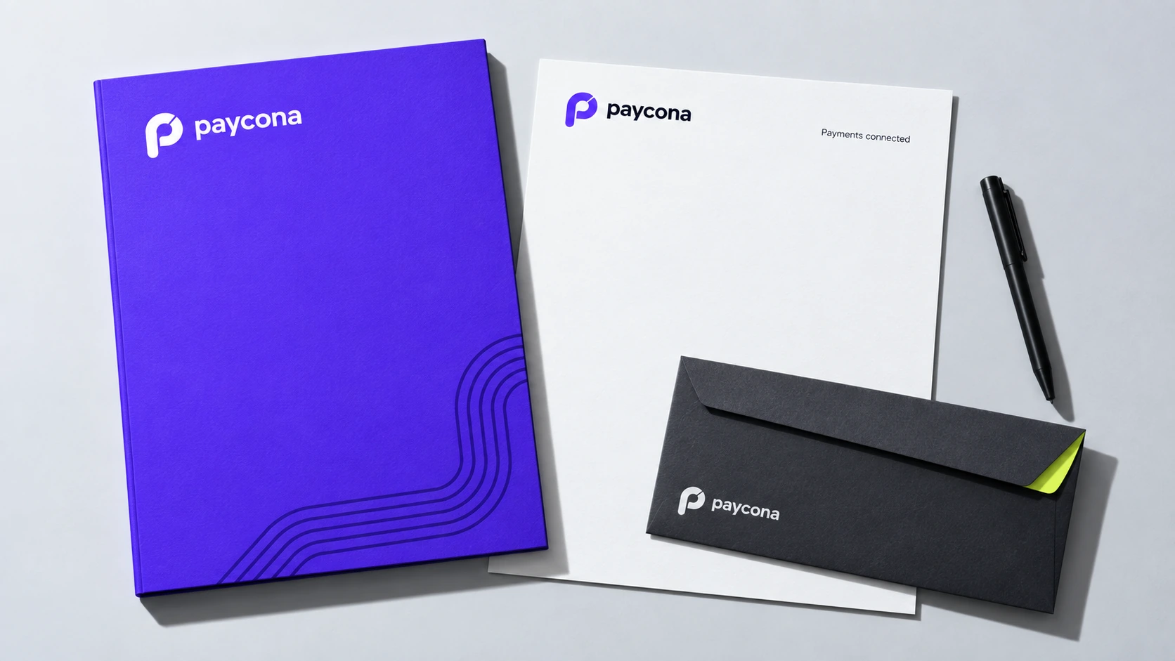
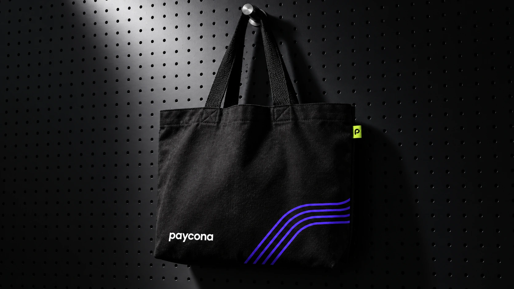
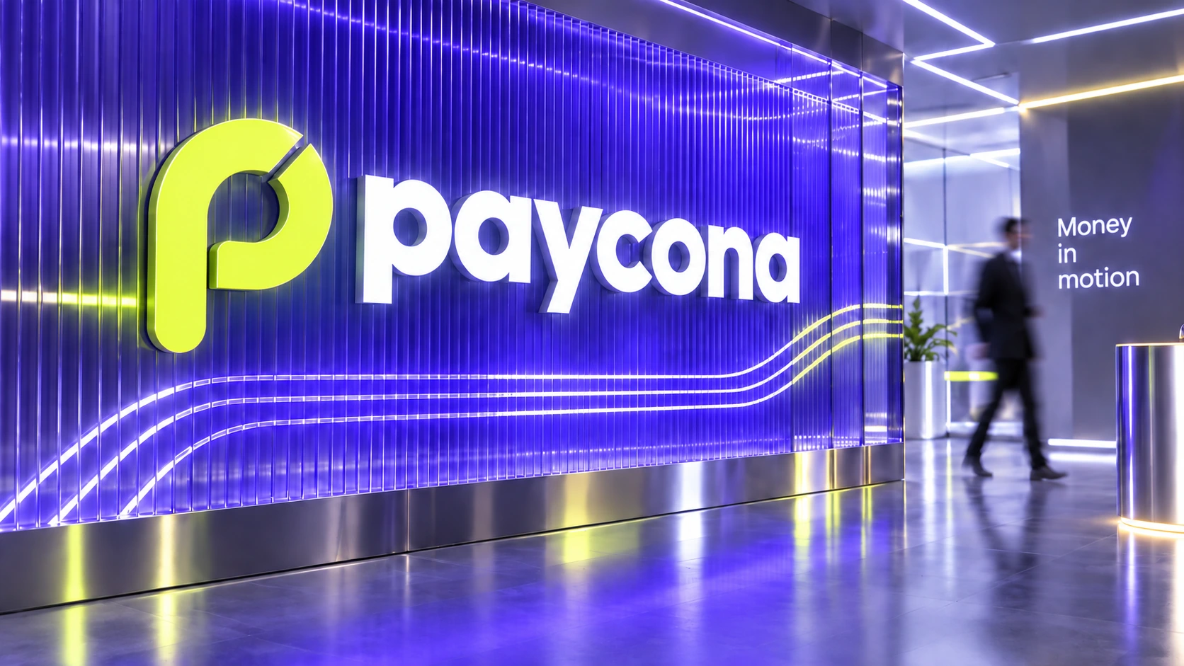
Electric violet gives Paycona its signature colour. Lime adds emphasis, while ink and ice backgrounds keep layouts balanced. A flowing line motif connects the system. It appears as a restrained graphic detail on stationery and as an iridescent form in key brand visuals.
PEOPLE
People in the brand
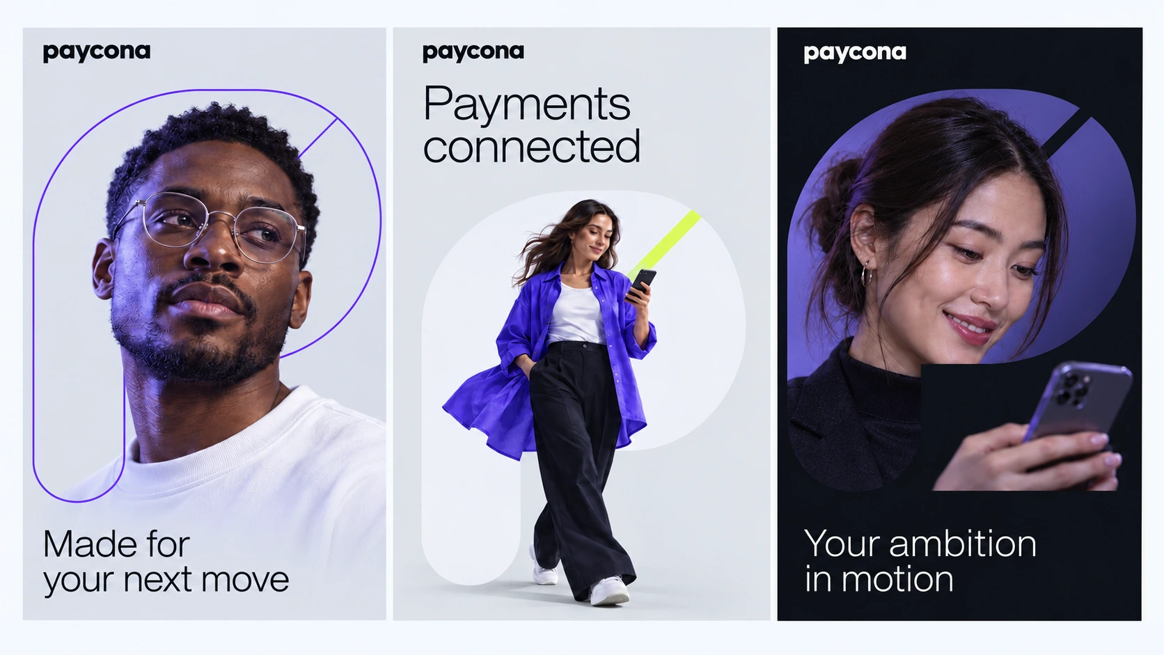
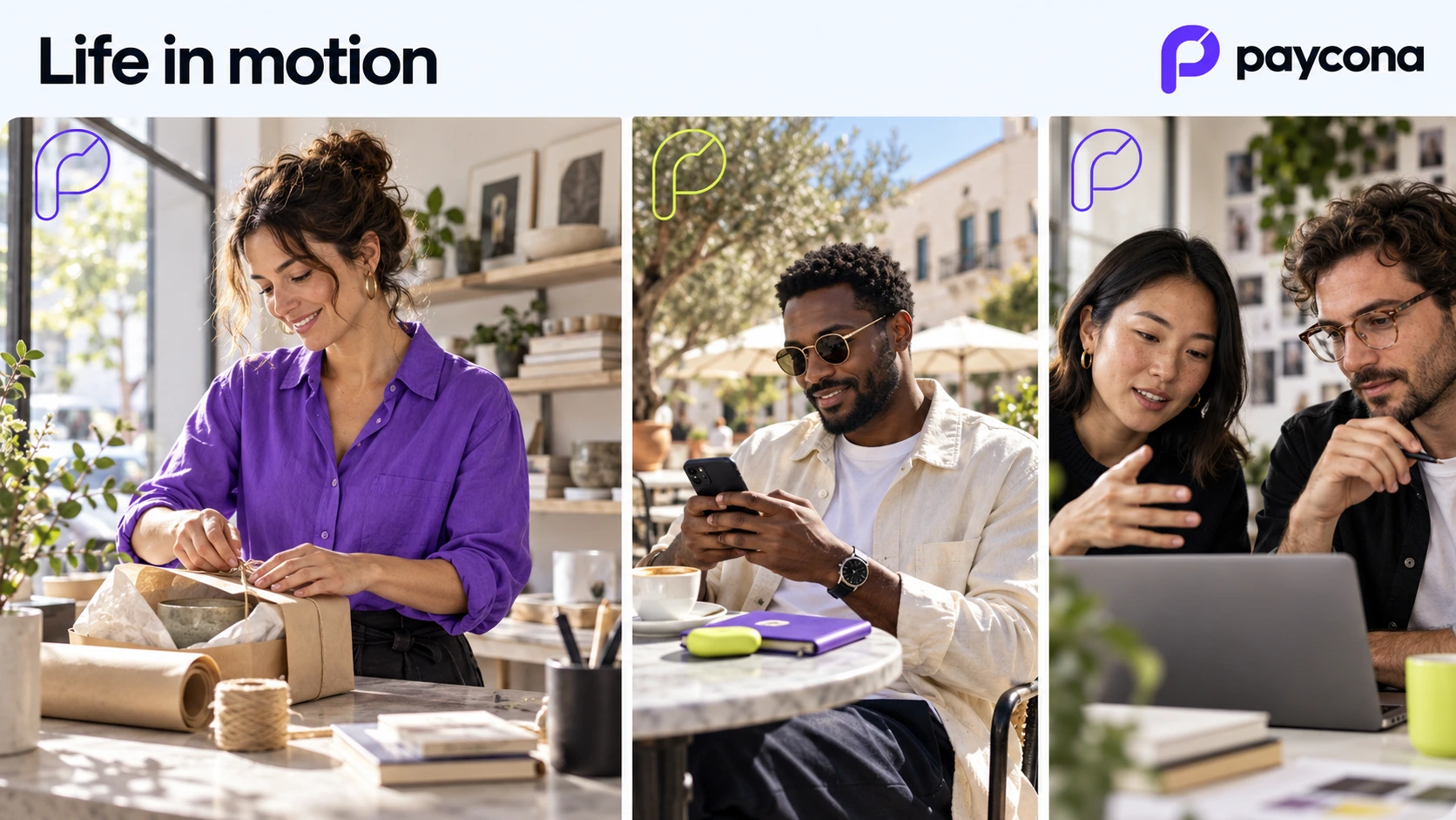
We introduced portraits and everyday business scenes to give the identity a human presence. People use their phones, prepare orders, talk and make payments. These moments connect the visual language with situations that feel familiar.

WEBSITE
Website and UI/UX design
We created a website direction that introduces Paycona through a clear message and a focused product preview. The visual hierarchy guides attention from the brand promise to the payment experience.
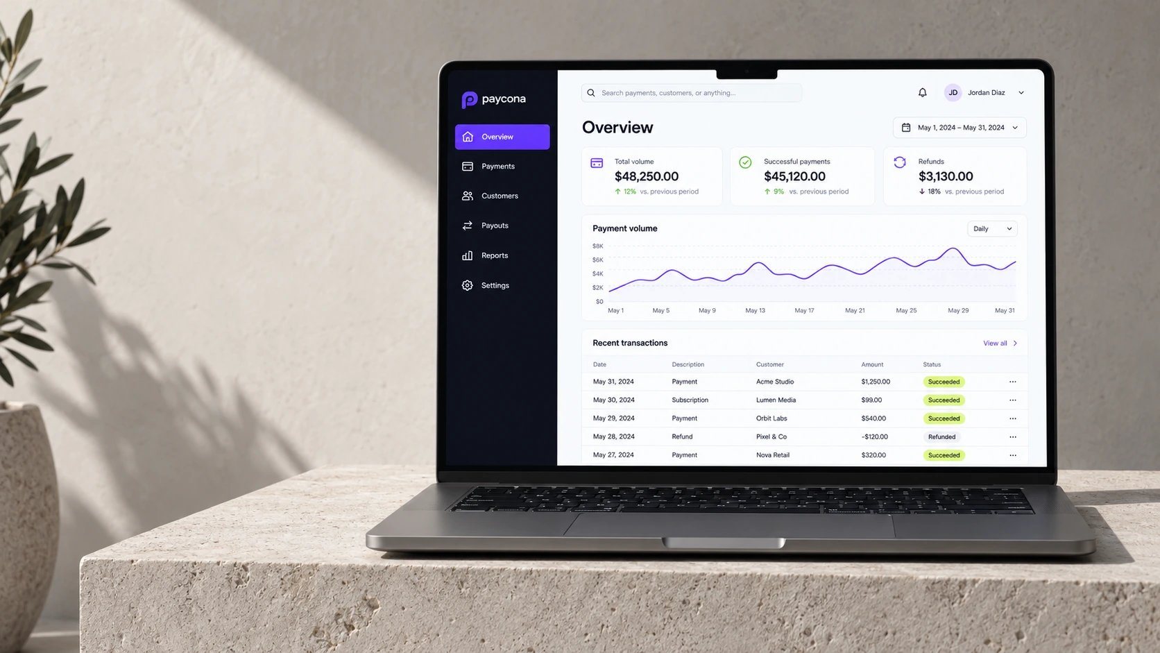
For the SaaS platform, we designed a proposed merchant workspace with an overview, payment list, transaction details, payment links and settlement views. The screens share a consistent navigation structure, spacing, typography and component language.
PRODUCT
Inside the SaaS platform
The overview brings key figures and recent activity into one view. The payments screen combines a list with a detail panel, allowing an individual operation and its status history to be understood in context.
The payment link flow connects a simple creation form with a checkout preview. The checkout sequence shows payment details, processing and confirmation, with a clear next step at each stage. A separate settlement view organises amounts, dates and statuses.
We also defined reusable interface elements, including buttons, fields and status labels. Colour supports these elements, while written labels make their meaning explicit.
APPLICATIONS
Physical applications
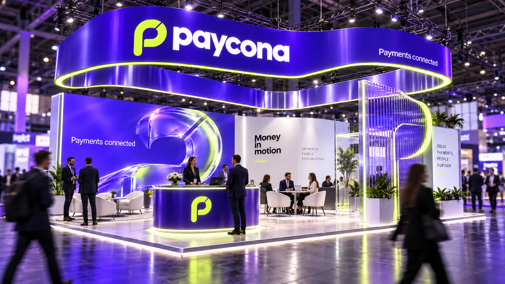
The same approach carries into the physical applications. We explored business cards, stationery, merchandise, a branded office environment and an exhibition stand concept. Each uses the same core elements with a different level of expression.
SCOPE
What we delivered
- Brand concept and visual direction
- Logo and application principles
- Colour palette and typography
- Graphic motif and key brand visuals
- Portrait and lifestyle art direction
- Business cards, stationery and merchandise concepts
- Office branding and exhibition stand visualisations
- Website design direction
- UI/UX design for the proposed merchant workspace
- Payment link and checkout flows
- App icon variants and reusable UI components
This work includes: logo and brand identity design, UI/UX design.
RESULT
The result
Paycona received a coherent design concept connecting brand communication with a proposed digital product. The identity is expressive in campaigns and more restrained inside the platform, while remaining recognisable throughout.
The case presents design work and visualisations. Product screens use sample data and illustrate proposed functionality.
Build a brand that works across every touchpoint
From identity to digital product, we help businesses turn their ideas into clear, consistent design.