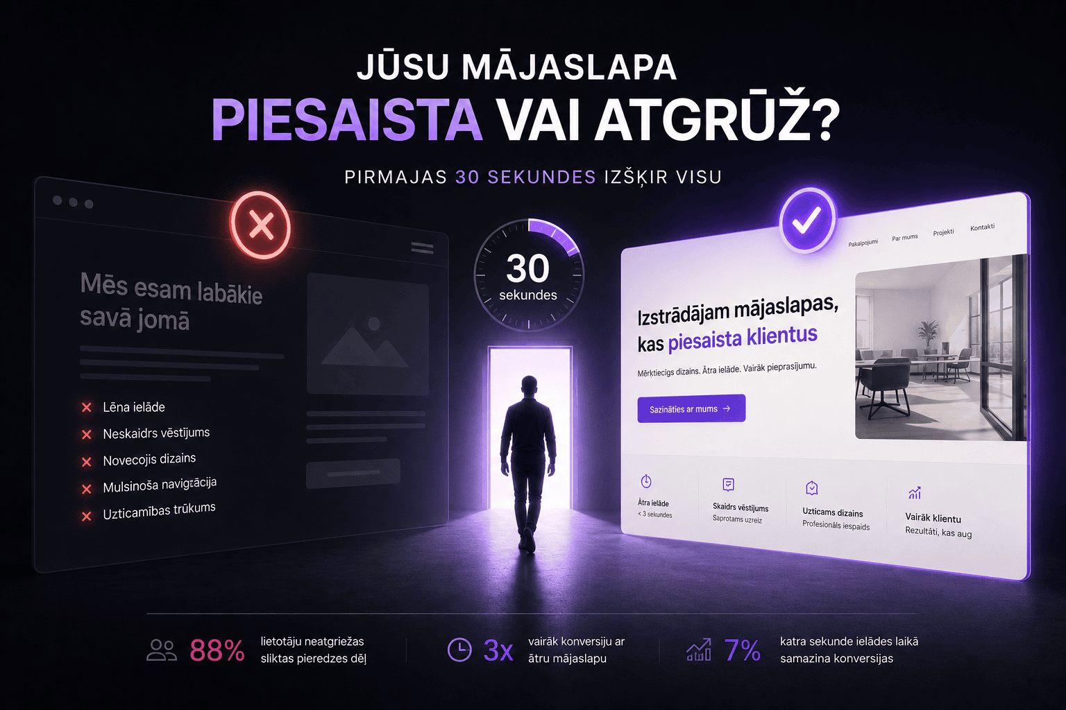
You invested money in your website. Maybe in Google Ads too. People come. But the numbers tell a brutal story - most leave in the first 30 seconds without doing anything. That's not a coincidence. It's a symptom. International research shows that 88% of users never return to a site after a bad experience. If something went wrong in those first seconds, you've lost the lead for good.
Reason #1: The site loads too slowly
If a mobile site loads longer than 3 seconds, 53% of visitors leave. Each additional second of delay increases bounce probability by 123%. A site that loads in 1 second converts 3 times better than one that loads in 5. In Latvia the average mobile load time is 6-9 seconds. Fix: Google PageSpeed Insights - if the mobile score is below 70, it's a priority. Optimize images to .webp, upgrade hosting, reduce JavaScript size.
Reason #2: Unclear headline - within 3 seconds it's not obvious what you do
Users read websites in an F-shaped pattern - most attention on the first lines. If the first 5 words don't answer "what does this company do?" - the visitor is lost. Fix: the headline must answer three questions - what you do, for whom, what benefit. Example: "We build high-converting websites for B2B companies in Latvia." Make it clear, not clever.
Reason #3: The design doesn't look trustworthy
60% of consumers avoid companies with unappealing design - even if reviews are good. The first visual impression forms in 50 milliseconds. Problems: outdated look, low-quality stock photos, mismatched colors and fonts, inconsistent appearance on desktop and mobile. Fix: ask a stranger to look at the site for 5 seconds - does it look professional? Often aligning colors, swapping a font and using quality photography is enough.
Reason #4: Navigation is confusing
25% of visitors never scroll - they leave from the first screen if navigation is overloaded. Fix: no more than 5-6 items in the header, one clear next action per screen, breadcrumbs for navigation. Test navigation on a phone.
Reason #5: Too many distractions
Pop-ups, auto-playing videos, animations, chatbots - each can look good on its own. Together they create chaos. Aggressive pop-ups that appear 2 seconds after page load reduce conversion. Fix: show pop-ups no earlier than 30 seconds in or on exit intent. For every element ask - does it help or hurt?
What to do now: a practical 15-minute audit
- Speed - is mobile PageSpeed above 70?
- Headline - is it clear within 3 seconds?
- Design - does it look professional to a stranger?
- Navigation - max 5-6 header items and works on phone?
- Distractions - no aggressive pop-ups or auto-playing video?
Is your website losing visitors?
Juice Digital Agency runs UX audits - we analyze your site and pinpoint exactly where visitors leave and why. The result: a concrete improvement plan with priorities. For B2B companies, see also the deeper analysis in Why your B2B website doesn't generate leads.